

Author: POWERPOINT UNIVERSITY
This comprehensive guide walks you through creating a polished, interactive “Our Services” slide in Microsoft PowerPoint. I’ll show you every step—from building the core shapes and adding images to styling icons, aligning content precisely, and applying smooth entrance animations. If you prefer a ready-made template, there’s a free download link you can use to jump-start your design.
Below you’ll find a single, easy-to-navigate table of contents, followed by clear, practical steps, screenshots at key moments (so you can match your slide to mine), design tips, keyboard shortcuts, variations for different presentation needs, troubleshooting, and an FAQ section to answer common questions.
Table of Contents
- Why design a dedicated “Our Services” slide
- What you’ll need before you start
- Step-by-step build: create the core visual
- Adding images and text
- Creating service tiles with icons and labels
- Polish and extra visuals
- Grouping and animating the slide
- Design variations and advanced tips
- Exporting and using your slide
- Troubleshooting common issues
- FAQ
- Conclusion
Why design a dedicated “Our Services” slide
An “Our Services” slide is more than a list of offerings. It’s a visual anchor that quickly communicates what you do, highlights the most important offerings, and provides a clean interaction point for presenters and audiences. When designed well, it helps your audience scan and absorb information quickly while making your presentation look polished and professional.
Good design reduces cognitive load. Instead of dense paragraphs, use concise headlines, short supporting text, and strong visuals—icons and images—to guide the eye. The slide I’m teaching you to build balances an eye-catching central image with clean, modular service tiles so you can show, focus, and explain each service with intent.
What you’ll need before you start
- Microsoft PowerPoint (desktop version recommended for full design and animation controls).
- A choice of fonts (I use Open Sans in the example).
- High-quality image(s) for the central visual (local or online images).
- Icons (PowerPoint’s built-in Icons library is used in this guide).
- Optional: the free downloadable template (link available at the end of this guide).
Quick file prep: Save your presentation folder and keep images and assets organized so you can quickly re-use them across slides.
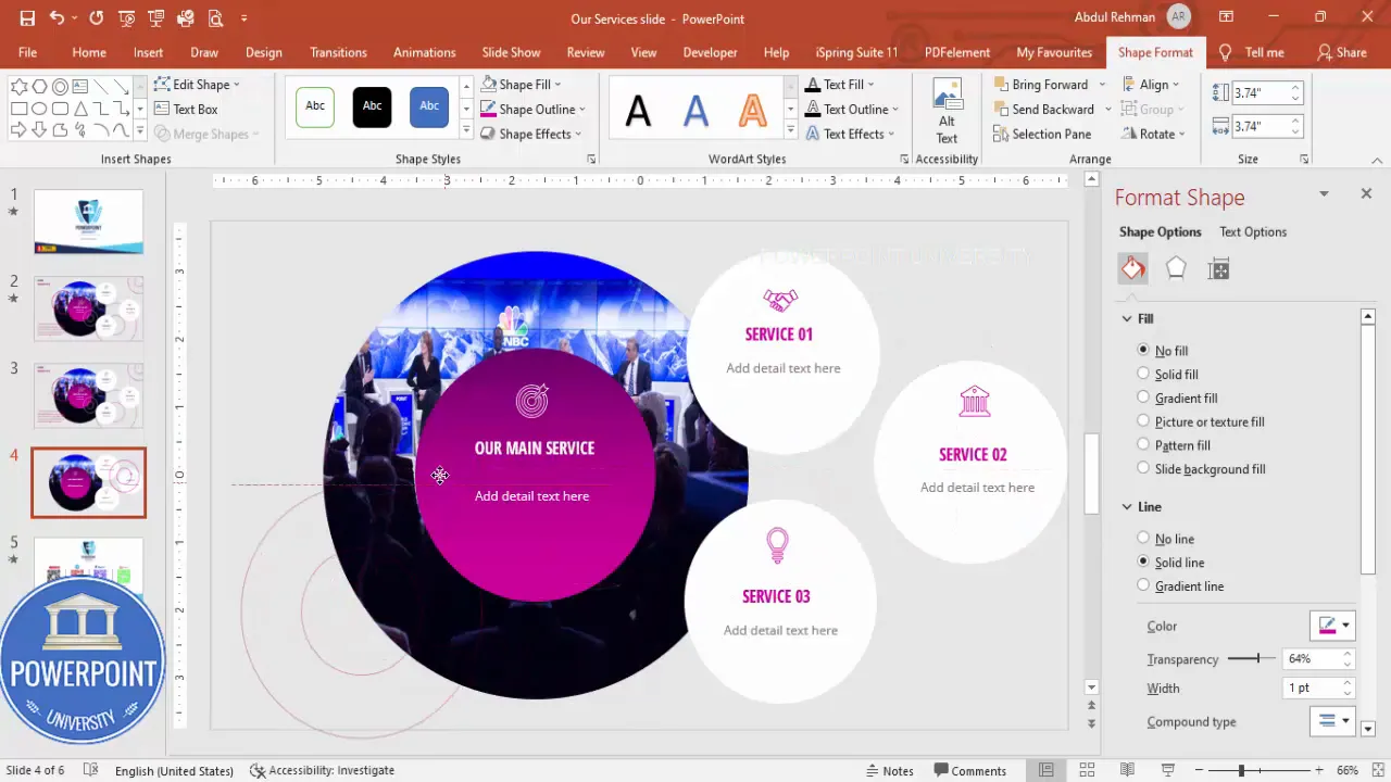
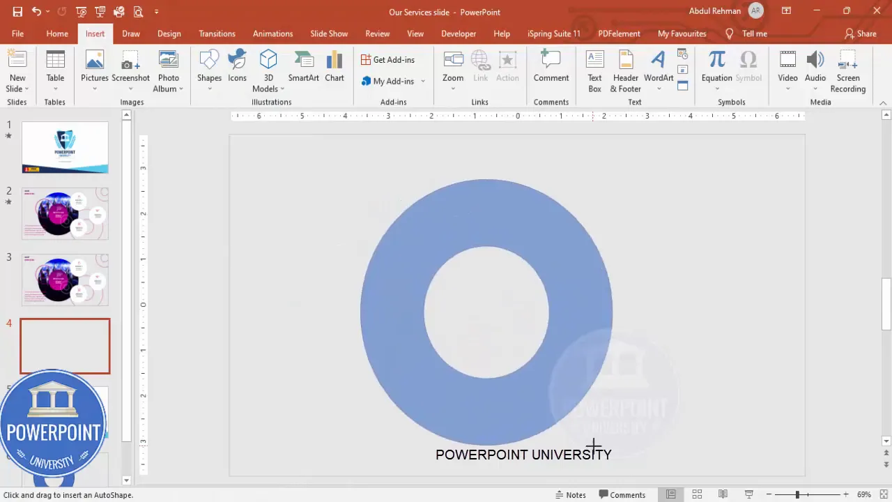
Step-by-step build: create the core visual
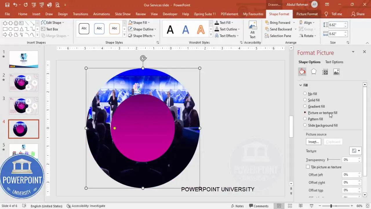
We’ll start by creating a central pair of concentric shapes: a hollow circle (for a border effect) and a filled oval (with image). This creates a strong focal point and gives the slide an anchored center that reads well on stage and remote presentations.
- Insert a new slide and set the background.
Choose a clean, soft background—light gray works well because it helps white and purple (or your brand color) elements pop without being harsh. To change slide background: right-click the slide -> Format Background -> Solid fill -> pick a light gray.
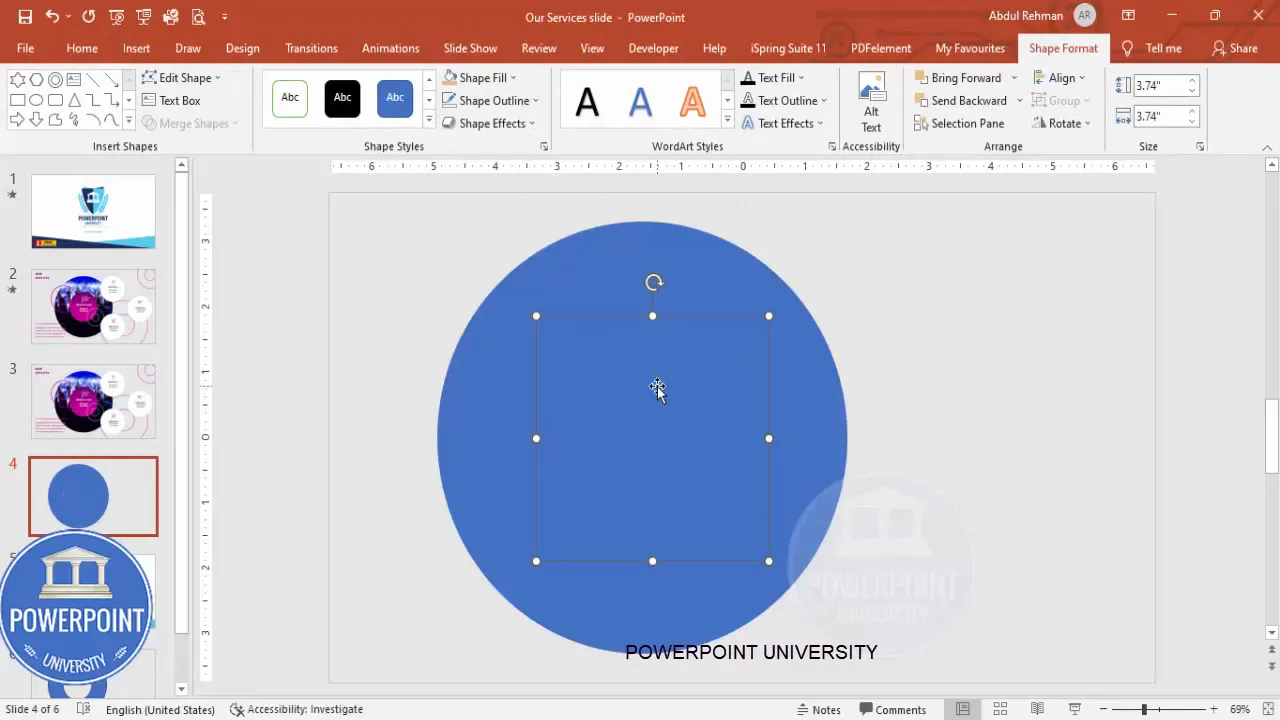
- Draw the hollow circle.
Insert -> Shapes -> Circle (Circle Hollow). Hold Shift while drawing to constrain proportions so it stays perfectly circular. Adjust size to taste depending on slide layout and amount of surrounding content. Remove the outline: Shape Format -> Shape Outline -> No Outline.
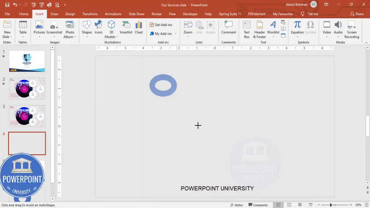
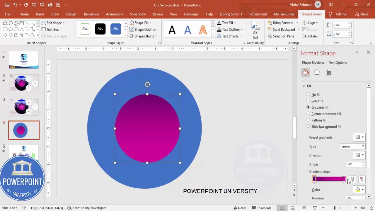
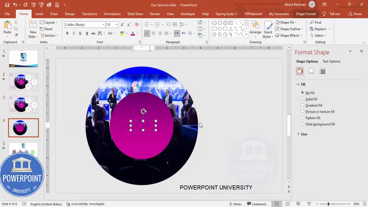
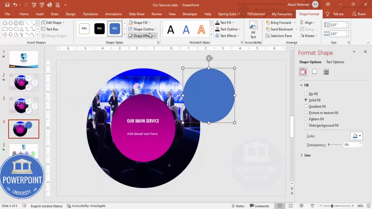
- Add the filled oval.
Insert -> Shapes -> Oval. Again, hold Shift for a perfect circle (or change proportions if you prefer a slightly elongated oval). Remove outline. Then: right-click -> Format Shape -> Fill -> Gradient Fill. Use two gradient stops for a subtle depth effect. For my design I used a dark purple and light purple gradient. This establishes a modern, cohesive background for the image layer.
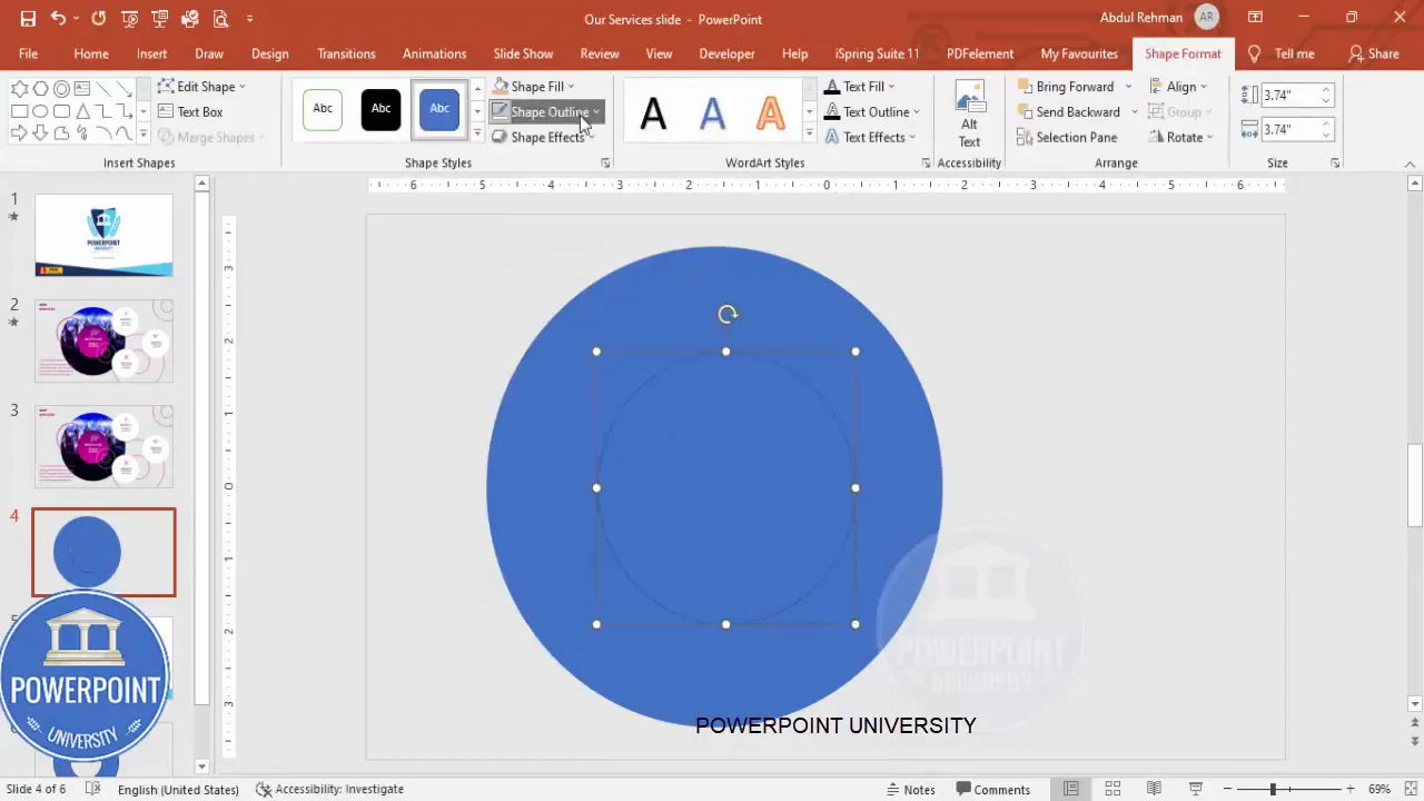
- Center the shapes.
Select both shapes, then Shape Format -> Align -> Align Center -> Align Middle. This guarantees the hollow circle and the oval stack perfectly on top of each other, creating a neat layered effect.
Why use concentric shapes?
Layered shapes create focus and hierarchy. The hollow circle acts like a frame and draws attention, while the filled oval contains the image or texture, providing context or mood without competing with the service tiles.
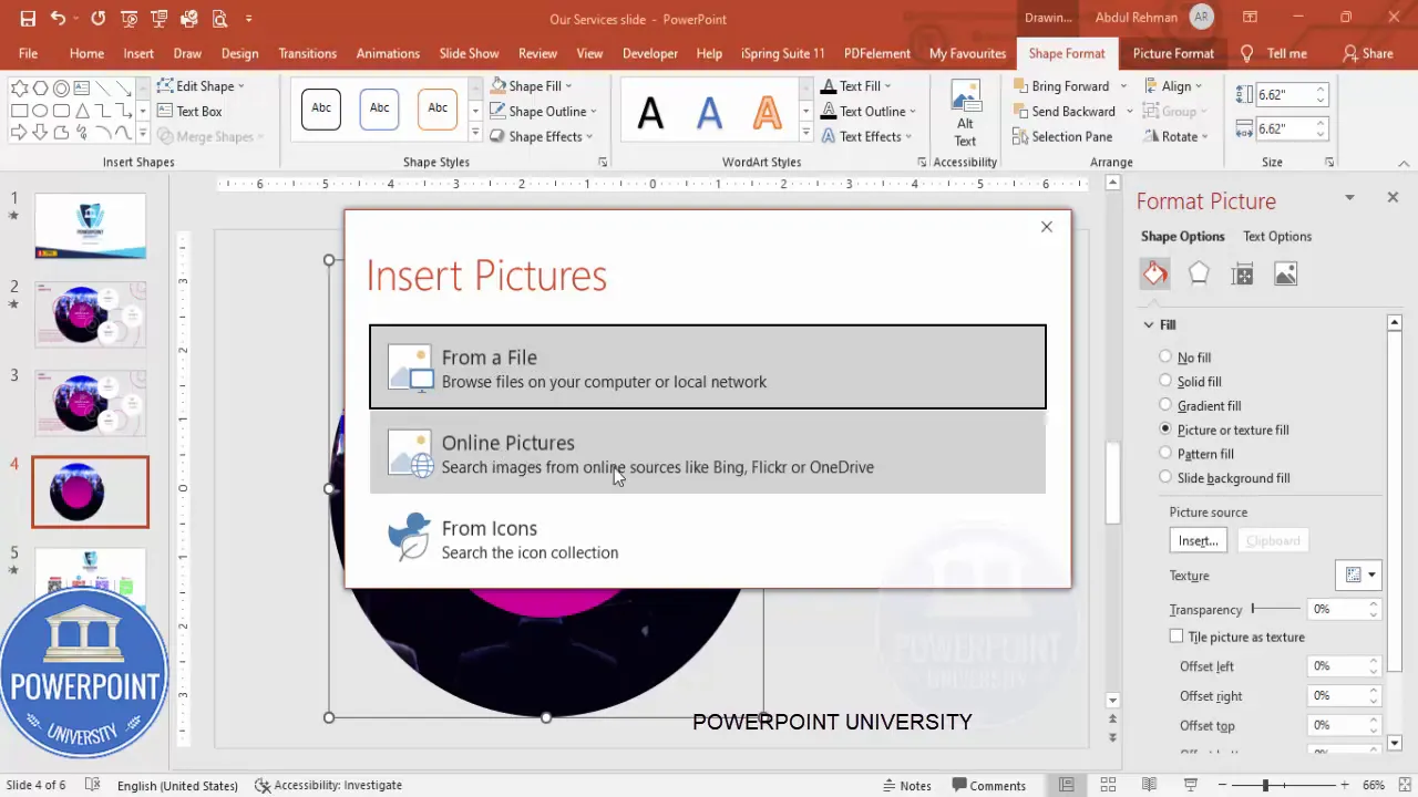
Adding images and text
Now that the core shapes are set, we’ll add an image to the larger oval and overlay headline text. The goal is to make the center feel purposeful—a high-level summary of your business or a brand image that complements the services.
- Insert image into the oval.
Select the larger oval -> Format Shape -> Fill -> Picture or texture fill -> Insert from file or Online Pictures. If PowerPoint shows a previously selected image, replace it if you prefer a new image (Insert -> Pictures -> This Device / Online Pictures).

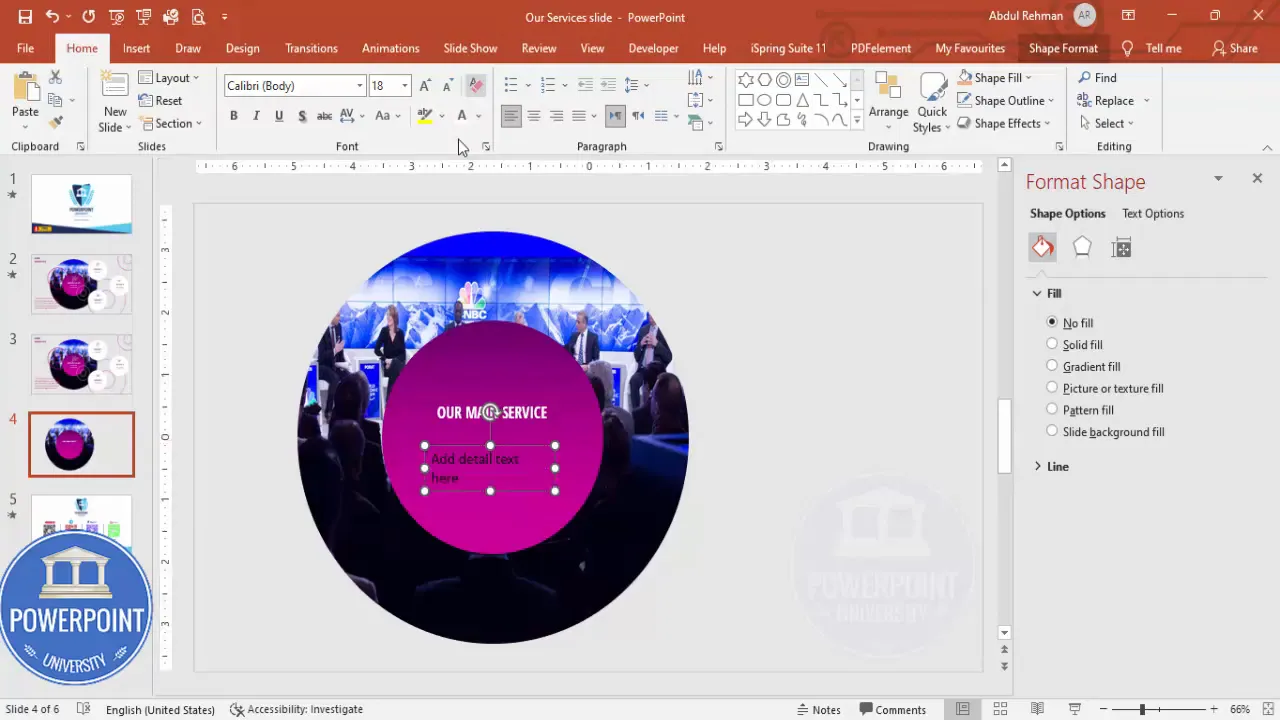
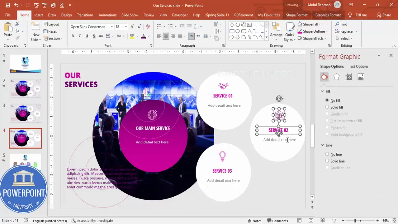
- Add the main headline text.
Insert -> Text Box. Type a succinct headline like “Our Services” or your company’s top offering. Use Open Sans (or another clean sans serif). In the example I used Open Sans Condensed (or a condensed/bold variant) and set the font color to white for maximum contrast against the purple gradient. Center align the text and place it near the top of the oval or centered depending on your layout preference.
- Add supporting subtext.
Insert another text box for a short descriptive line under the headline. Keep it succinct—6 to 12 words. Use a smaller Open Sans regular (not condensed) in white, center-aligned. Use a smaller font size to establish hierarchy between headline and supporting text.
Design note: Avoid overcrowding the central image with text. The goal is visual clarity. If your central imagery is busy, either reduce the image opacity (Format Picture -> Transparency) or add a subtle overlay to increase text legibility.
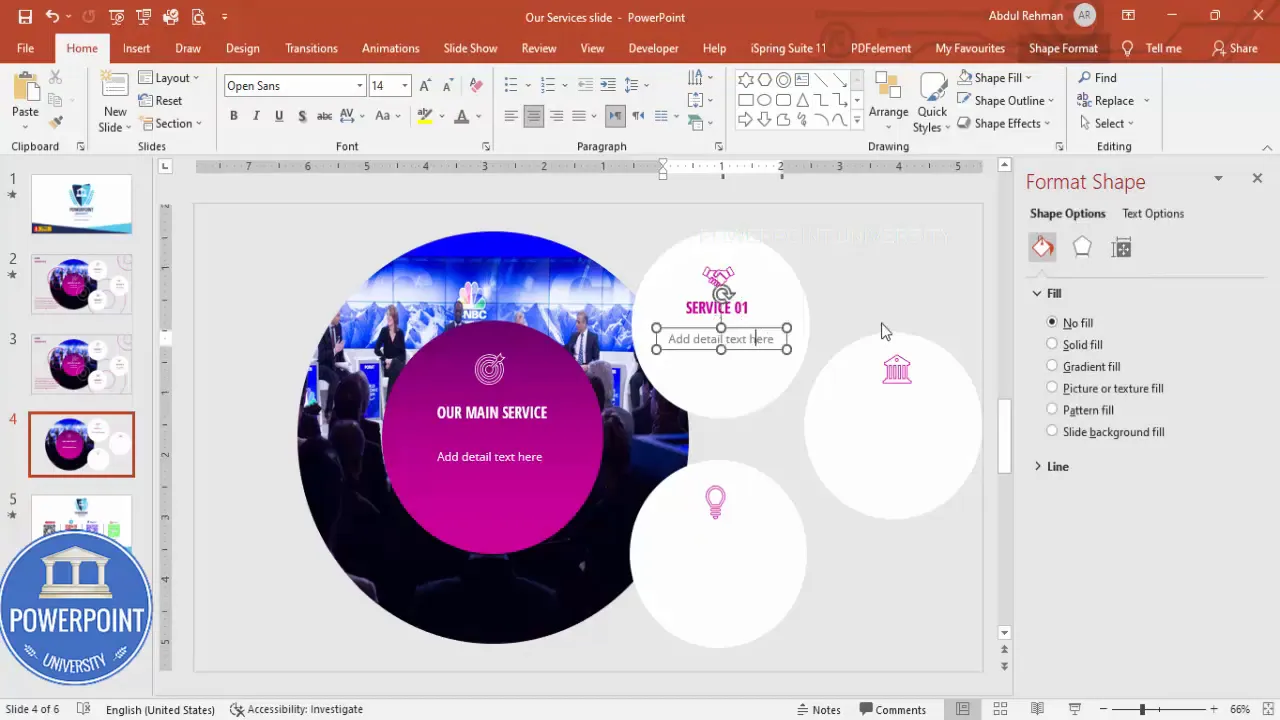
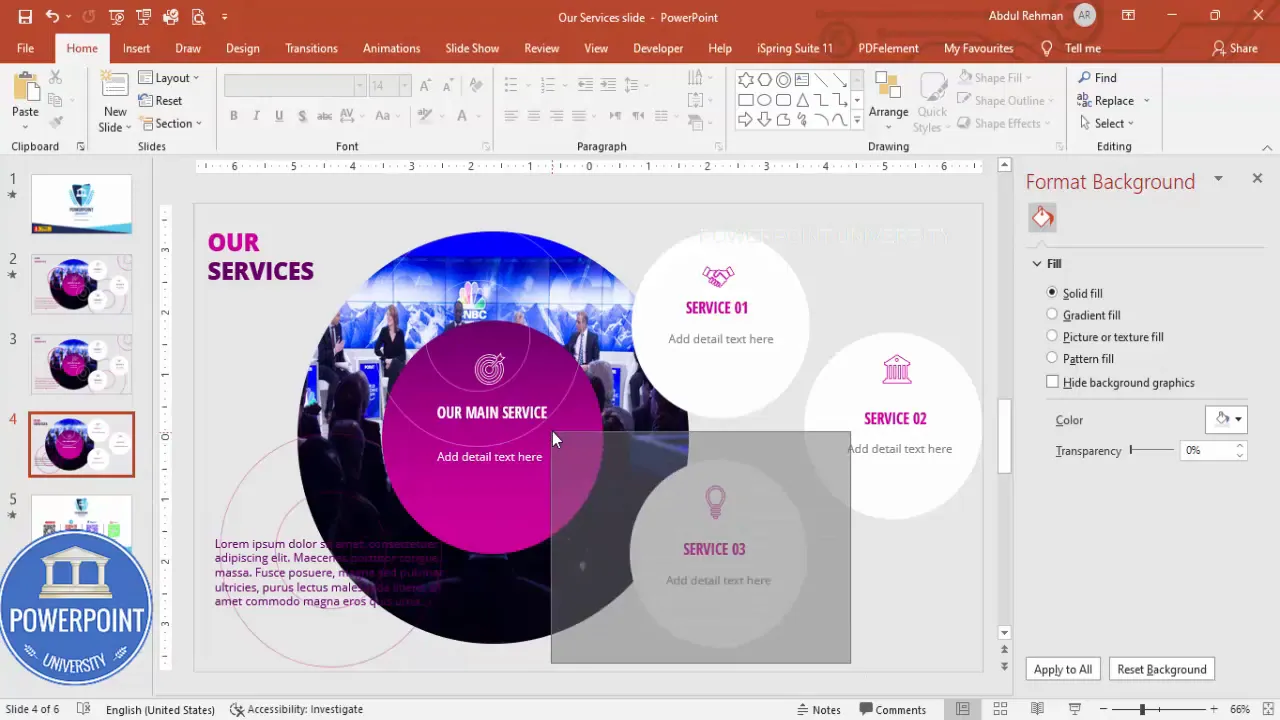
Creating service tiles with icons and labels
Next, we’ll build the service modules—small white ovals placed beneath or alongside the central focal point, each with an icon, a numbered label, a service name, and a short descriptive line. These act like navigation buttons when animated to appear sequentially.
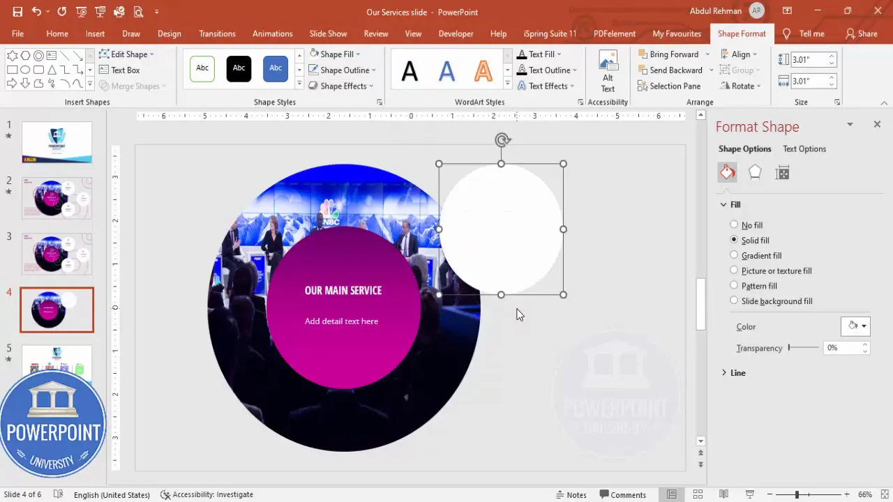
- Insert service ovals.
Insert -> Shapes -> Oval (hold Shift to keep it proportional). Set the Shape Outline to No Outline and Shape Fill to White. Create one tile and then use Ctrl+D to duplicate it twice (or as many times as services you want to display). Align them horizontally or vertically depending on your chosen layout.
- Add icons.
Insert -> Icons. Choose icons that clearly represent each service (e.g., consulting, development, marketing). Insert them, then style: Graphic Fill -> No Fill and Graphic Outline -> Purple (match brand color). Increase the outline weight to make the icon stroke visible. Resize icons (I used approximately 0.6 height/width in the example) and position them within each white oval.

- Add service numbers and names.
Duplicate the central text box used for numbering or create a new text box. Set the number color to your brand purple and place it near the icon (e.g., top-left of each tile). Then add the service name using a bolder purple text. Use smaller gray text for the short description under each service name.
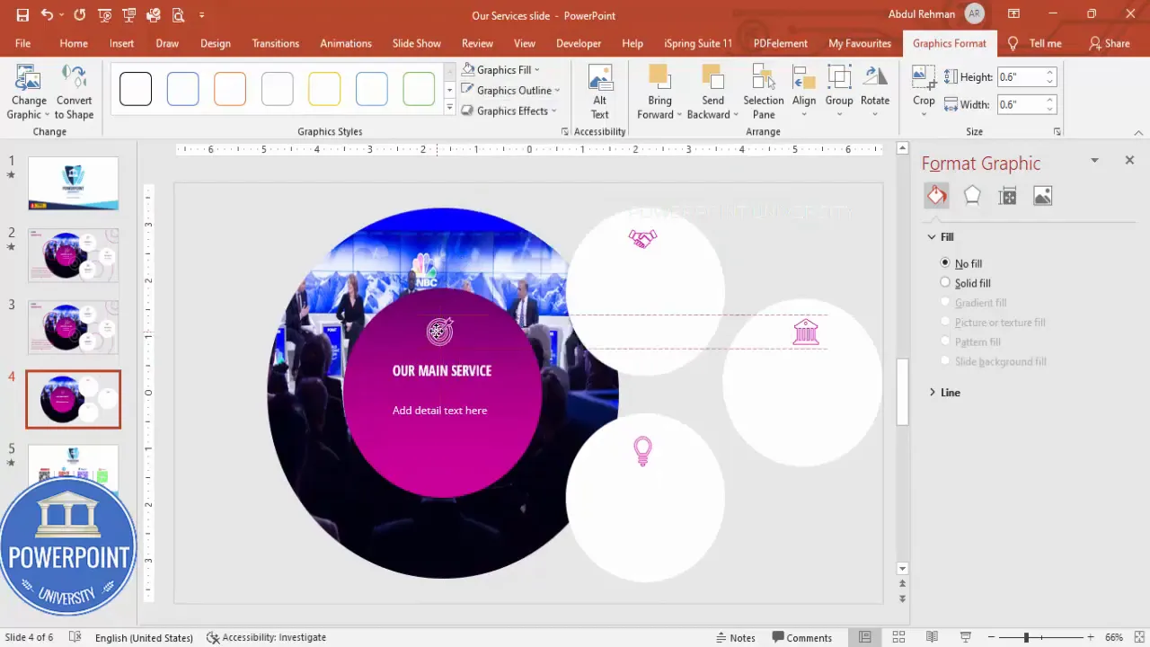
- Duplicate and align tiles.
Select the entire tile (icon + numbers + texts), then use Ctrl+D to duplicate and position the next tiles. Keep equal spacing between tiles to maintain alignment and visual balance. Use Shape Format -> Align -> Distribute Horizontally (or Vertically) to ensure even gaps.
Best practices for service tiles
- Keep labels short—one to three words for the service name, one short sentence (10–15 words) for the description.
- Maintain consistent icon stroke-weight and size across tiles.
- Use color sparingly—reserve brand accent colors for numbers or key words to create a consistent visual system.
- Consider using hover or click interactions if exporting to an interactive format like PowerPoint in presentation mode or a web-friendly format (e.g., PDF with links).
Polish and extra visuals
Small graphic elements around the slide add depth. In this design I used simple, translucent outlines and small accent circles to make the composition more dynamic without creating clutter.
- Add accent shapes.
Insert -> Shapes -> circle/ellipse. Hold Shift and draw small circles. Remove fill or set fill to no fill and outline to purple. Reduce transparency if you want a washed look (Format Shape -> Fill -> Transparency or Outline -> Color -> More Colors -> set transparency). Place a few randomly around the composition for a subtle decorative touch.
- Headline and subhead copy.
Place the main slide headline (e.g., “Our Services”) at the top-left or top-center of the slide in a stronger weight (Extra Bold or SemiBold). For the subhead/detail text below the headline, use a medium-weight font and brand color. Keep body copy contrast high for legibility (dark purple on a light gray background works well).

- Spacing and alignment checklist.
- Ensure central focal point and tiles align to an invisible grid.
- Make margin space around the edges equal—this gives breathing room.
- Consistent padding inside service tiles improves readability.
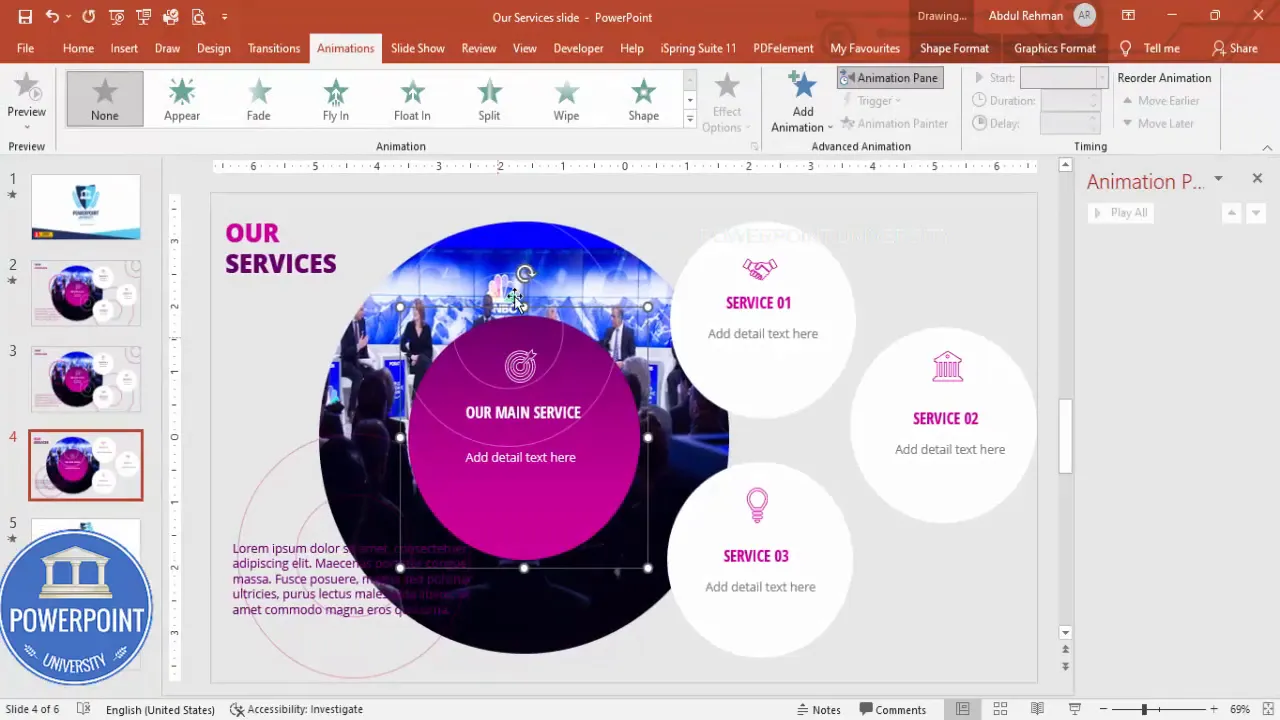
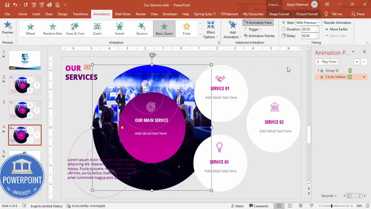
Grouping and animating the slide
Animations are a powerful way to sequentially reveal services during a presentation, focusing audience attention as you speak. Grouping related objects simplifies animation and slide management.
- Group related objects.
Select the elements that belong together (e.g., a service tile’s icon, number, name, and description). Press Ctrl+G (or Shape Format -> Group). Group the central shapes and text separately if you plan to animate them differently.
Create Slides in Seconds with ExpertSlides AI
Generate AI Presentations today:
TRY NOW!
- Open the Animation Pane.
Animations -> Animation Pane to view and sequence animations. This pane is essential for fine-tuning start options and timings.
- Apply entrance animations.
For a polished reveal I used Basic Zoom (Add Animation -> More Entrance Effects -> Basic Zoom). Set the central group to zoom from outside (makes it appear to expand into place). For neutral balance, set supporting service tiles to “Zoom In” or “Fade” with the “With Previous” or “After Previous” settings depending on how you want them to appear. Use Animation Painter (on the Animations tab) to copy animation settings between groups for consistency.
- Tweak animation timing and order.
In the Animation Pane, adjust the delay, duration, and sequence. For example:
- Central image: Duration 0.6s, Start: On Click
- Service 1: Duration 0.45s, Start: With Previous (or On Click to control manually)
- Service 2: Delay 0.2s, Start: After Previous
- Preview the animation.
Click Play in the Animation Pane or run the Slide Show to preview the animations. Adjust as needed for pace and flow. Remember: animations should support the message, not distract from it.
Pro tip: Use “On Click” for the first reveal and “With Previous” for items that should appear in a single breath. This gives you control while keeping a smooth cadence during delivery.
Design variations and advanced tips
Below are alternative layouts and advanced tips you can adopt based on different presentation contexts—client pitch, internal meeting, or website export.
Layout variations
- Vertical layout: Stack service tiles vertically along the left or right side and place the central image opposite. Better for portrait screens and mobile exports.
- Grid layout: Use four service tiles in a 2×2 grid around a smaller central image. Works well if you have equal-weight offerings.
- Full-bleed central image: Use the purple gradient as an overlay and place service tiles on white cards above it. Great for more visual storytelling.
Styling alternatives
- Color themes: Substitute purple with your brand’s accent color—teal, orange, or navy can change the mood dramatically.
- Icon style: Choose filled icons for a bolder look or outline icons for a lighter, modern feel. Keep icon family consistent.
- Shape variations: Use rounded rectangles instead of ovals for a more corporate look.
Advanced PowerPoint tricks
- Masking images: Use Merge Shapes -> Intersect to crop images into custom shapes. This is useful when you want shapes other than circles or ovals.
- Custom shadows: Format Shape -> Shadow -> Offset and Blur to create subtle depth.
- Use Slide Master: If you’ll reuse this layout across multiple slides, add it to the Slide Master so you can update globally.
- Export with animations: Save as a .pptx to preserve animations. For sharing without PowerPoint, export to a video file (File -> Export -> Create a Video) or interactive PDF (animations not preserved in PDF).
- SVG icons: Insert SVGs for crisp scaling and then ungroup as shapes to recolor or animate individual parts.
Exporting and using your slide
When your slide is complete, consider how it will be used—live presentation, emailed deck, or embedded on a website. Each usage has practical considerations:
- Live presentation: Keep the file as .pptx or use Presenter View. Memorize the animation clicks for a smooth delivery.
- Email deck: Save as PDF for broadest compatibility. Remove or bake animations into slides if the recipient is likely to use PDF viewers.
- Website or LMS: Export slide as PNG/JPEG for static uses, or as MP4 if you need the animation preserved for playback. For interactive web use, consider converting slides into HTML/CSS using specialized tools.
Free download: If you prefer a ready-made template, I provide a downloadable animated PowerPoint template: the “Our Services” slide. You can customize it quickly with your images, icons, and copy.
Troubleshooting common issues
Here are problems you might run into and how to fix them quickly.
- Icons show incorrectly after copying: Reinsert icons via Insert -> Icons; avoid pasting from external sources if they lose formatting.
- Text not visible over image: Add a semi-transparent overlay shape between the image and the text or increase text contrast.
- Animation order wrong: Open Animation Pane and drag animations into the correct sequence; set start options to On Click / With Previous / After Previous appropriately.
- Fonts replaced on another computer: Embed fonts (File -> Options -> Save -> Embed fonts in the file) or use system-safe fonts like Arial if sharing widely.
- Slides look misaligned on different screens: Test on multiple devices and use Slide Show -> Set Up Slide Show -> Browsed by an individual (window) if embedding the presentation in other apps.
FAQ
Q: Which font should I use if I don’t have Open Sans?
A: Use any modern sans serif like Roboto, Lato, or Arial. The key is consistent weights: bold/semi-bold for headlines, regular for body text. If you need to share widely and avoid embedding, stick to system fonts like Arial or Calibri.
Q: How can I ensure my icons stay crisp on large displays?
A: Use vector formats. PowerPoint’s built-in Icons are vector-based and scale perfectly. If you use external icons, prefer SVG files or high-resolution PNGs.
Q: Can I make the service tiles clickable to jump to detailed slides?
A: Yes—use Insert -> Link (or right-click -> Link) and set it to go to a slide in the presentation. In Slide Show mode, clicking the tile will navigate to the linked slide.
Q: What animation settings work best for professional presentations?
A: Keep animations subtle. Duration between 0.4s to 0.7s is comfortable. Use “Entrance” animations like Fade or Zoom and avoid overly decorative animations like Bounce or Swivel which can distract.
Q: How do I ensure accessibility (e.g., screen readers)?
A: Provide alt text for images (Right-click image -> Edit Alt Text) and avoid embedding essential info solely in images. Use high-contrast color combinations and readable font sizes (minimum 18–24 pt for body). Consider providing a text-only handout or slide notes that summarize the content for screen reader users.
Q: How can I adapt this design for mobile?
A: Use vertical stacking and increase font sizes for small screens. Keep interactive elements large enough for touch (minimum 44px target size) and reduce the number of items per slide to one or two to avoid clutter.
Step-by-step checklist (quick reference)
- Create new slide and set light gray background.
- Insert hollow circle and filled oval; remove outlines and apply gradient to the oval.
- Fill the oval with an image and add headline + supporting text (use white text on dark background).
- Create white oval service tiles; add icons, numbers, names, and descriptions.
- Duplicate and align tiles with equal spacing; add decorative accents if desired.
- Group related elements and open Animation Pane.
- Apply Basic Zoom or Fade animations; copy settings with Animation Painter and adjust timing.
- Preview, tweak, and export as needed (.pptx to preserve animations; PDF/PNG/MP4 for other uses).
Additional tips to make the slide more persuasive
- Lead with benefits: On each service tile, use the name and one short benefit rather than simply a description—this highlights customer impact.
- Use data badges: If relevant, add a small badge that shows a metric (e.g., “10+ years”, “99% satisfaction”) to add credibility.
- Prioritize services visually: If one service is your flagship, increase its tile size slightly or use a slightly different shade to emphasize it.
- Call-to-action: At the slide’s bottom or the end of the animation sequence, include a CTA like “Contact Us” with a slide link or email action.
Sample slide copy examples you can plug into your design
- Headline: Our Services
- Subhead: Tailored solutions to accelerate your growth
- Service #1: Strategy Consulting — Focused insights and roadmaps that align teams and accelerate product-market fit.
- Service #2: Product Design — Human-centered design that turns ideas into intuitive digital experiences.
- Service #3: Marketing & Growth — Data-driven campaigns that convert and scale.
Credits and template download
This tutorial was adapted from a presentation by POWERPOINT UNIVERSITY. If you’d like to use the exact animated “Our Services” slide template I built for this tutorial, you can download it for free from the template link provided by the author. The template includes the grouped objects, icons, and animations so you can customize quickly.
Final thoughts
Designing an effective “Our Services” slide is a balance of clarity, hierarchy, and polish. Focus on concise text, consistent visual language (icons, colors, shapes), and deliberate animations that support your narrative. Group elements for efficient editing, use slide master for reusable layouts, and preview on the device you’ll present from.
With the steps and tips above, you’ll be able to produce a slide that is visually engaging, easy to follow, and tailored to various presentation contexts—whether you’re pitching to clients, presenting internally, or sharing your deck online.
If you want a shortcut, use the provided downloadable template to jump-start your design, then apply your brand colors, imagery, and copy.
Frequently requested screenshots (for quick matching)


FAQ (extended)
How do I keep the slide fast and not lag on older machines?
Keep high-resolution images within reasonable limits (e.g., under 2MB each). Avoid excessive shadow blur and very large embedded media. Compress images in PowerPoint (File -> Reduce File Size or Picture Tools -> Compress Pictures). Use fewer simultaneous animations and avoid hardware-intensive transitions like 3D effects on older systems.
Can I reuse this layout in a template for multiple clients?
Yes. Place the design on the Slide Master and create brand variants using different color themes. Keep the layout flexible by using placeholders for image and text so you can swap content without moving objects manually.
What if I need more than three services?
Scale the tile sizes down and maintain consistent spacing. Alternatively, create multiple slides—each slide can present 3–4 services and use navigation links to jump between them during the presentation.
Closing
Designing an “Our Services” slide doesn’t have to be daunting. Use a clear structure (central visual + modular tiles), consistent typography and color palette, and subtle animations to guide your audience. With these steps, you’ll create a confident, professional slide that elevates your message. If you want the exact starting point, check out the free template from the author to modify quickly.
Good luck designing, and remember: simplicity and clarity are your best friends when communicating services—less friction, more impact.
Check out the full video: Our Services Slide in PowerPoint. Tutorial No.: 1004


