
When it comes to presenting complex processes to higher management or stakeholders, clarity and simplicity are paramount. If you ever find yourself trying to explain a multi-step process using dense text slides, you know how quickly you lose your audience’s attention. Fortunately, PowerPoint functions offer powerful tools to help you visualize processes effectively, and one of the best ways to do this is by creating Data Flow Diagrams (DFDs). In this comprehensive guide, we’ll walk through the step-by-step process of creating a clear and engaging data flow diagram in PowerPoint, using an example of an online ordering system. This tutorial not only enhances your presentation skills but also deepens your understanding of how to leverage PowerPoint functions for professional process mapping.
This article is inspired by insights from POWERPOINT UNIVERSITY, known for delivering practical and easy-to-follow PowerPoint tutorials. Whether you are a beginner or looking to sharpen your presentation design skills, this guide is packed with useful tips, practical steps, and examples to help you create impactful data flow diagrams that simplify communication and impress your audience.
Table of Contents
- Why Use Data Flow Diagrams Instead of Text-Based Process Slides
- Overview of the Online Ordering Process
- Step-by-Step Guide to Creating a Data Flow Diagram in PowerPoint
- Key PowerPoint Functions Used in Data Flow Diagrams
- Tips for Creating Effective and Professional Data Flow Diagrams
- Frequently Asked Questions (FAQ)
- Conclusion
Why Use Data Flow Diagrams Instead of Text-Based Process Slides
Imagine presenting a detailed twelve-step online ordering process to your company’s senior management. If you simply list each step in dense text format, you risk losing your audience’s interest and clarity. As the saying goes, “nobody has the time to go through each step and understand.”
Data Flow Diagrams (DFDs) are visual representations that map out the flow of data within a system, showing how input data moves through processes and results in outputs. They transform complex textual information into easy-to-understand visuals. Here’s why DFDs are preferable:
- Clarity: They simplify complex processes by breaking them down into visual components.
- Engagement: Visual diagrams are more engaging and easier to follow than long text slides.
- Communication: They improve communication between technical and non-technical stakeholders.
- Efficiency: They allow quicker understanding and decision-making during presentations.
By converting a multi-step process into a data flow diagram, you provide a clear roadmap that everyone can understand at a glance. This increases the impact of your presentation and establishes you as a skilled communicator.
Overview of the Online Ordering Process
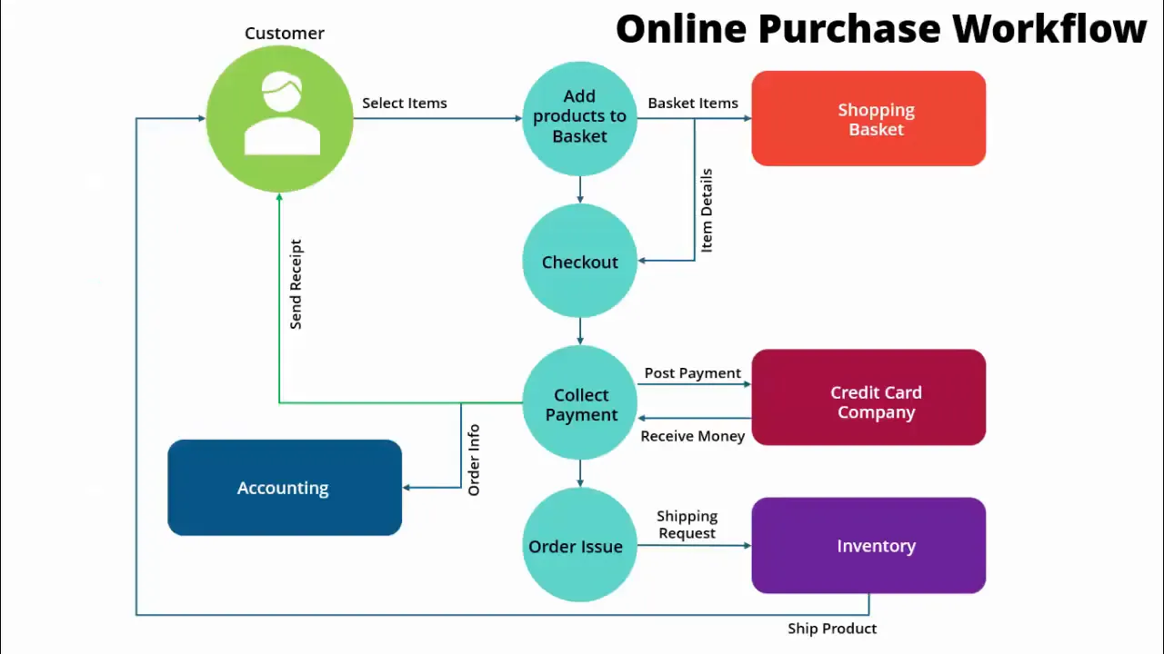
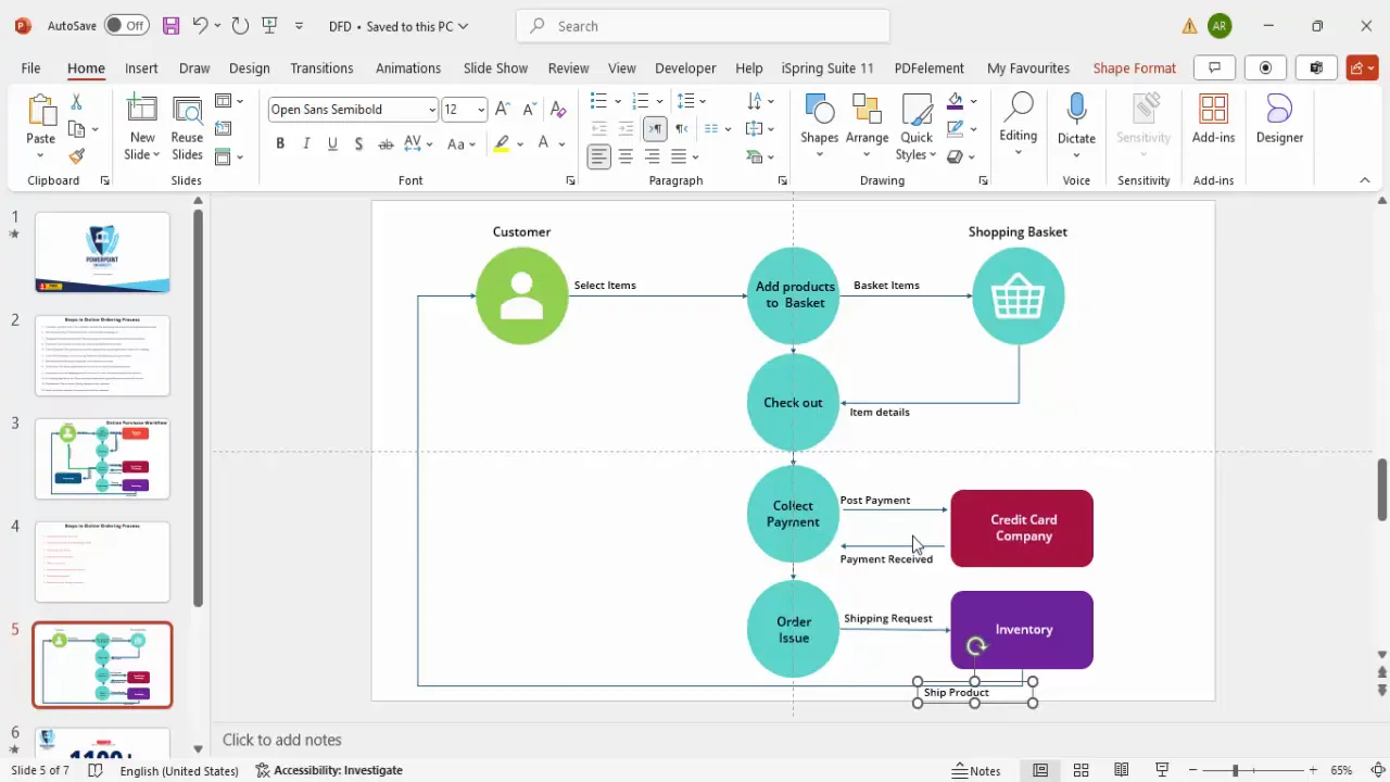
Before diving into the creation of the data flow diagram, it’s important to understand the process we are going to visualize. The example used here is an online ordering workflow that includes 12 steps, starting from the customer selecting items and ending with the product shipment.
Here is a simplified summary of the key steps:
- Customer selects items.
- Items are added to the shopping basket.
- Customer proceeds to checkout.
- Item details are sent to checkout.
- Payment is collected (e.g., via credit card).
- Payment information is sent to the credit card company or bank.
- Payment confirmation is received.
- Order is issued.
- Inventory department is notified.
- Inventory prepares the shipment.
- Product is shipped to the customer.
- Accounting logs the payment and sends receipt to the customer.
Instead of listing these steps in long text, we will convert them into a data flow diagram that clearly shows the flow of data and the interactions between different departments and entities.
Step-by-Step Guide to Creating a Data Flow Diagram in PowerPoint
Now, let’s explore how to use PowerPoint functions to create a professional data flow diagram illustrating the online ordering process. Follow these detailed steps to build your own diagram from scratch.
Step 1: Prepare Your Slide and Enable Guides
Start by adding a new blank slide in your PowerPoint presentation. To help with alignment and positioning:
- Go to the View tab.
- Enable Guides to help place elements precisely.
This ensures that all shapes and icons you insert will be aligned neatly, giving your diagram a professional look.
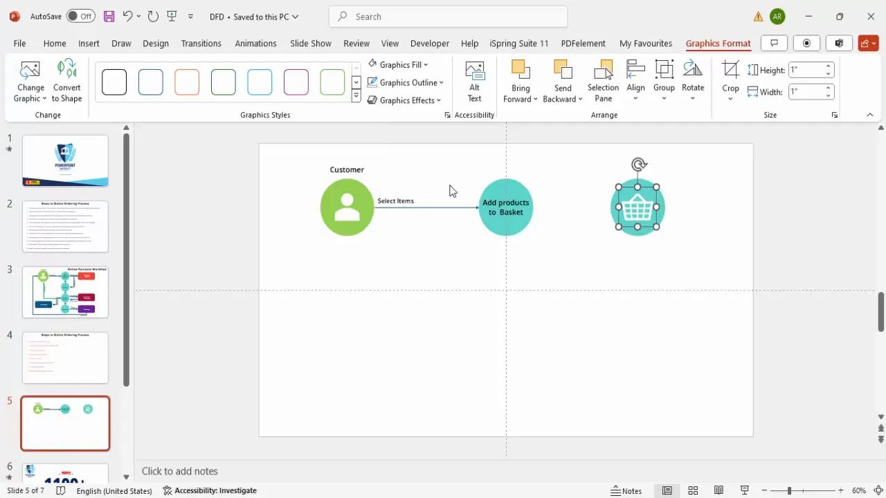
Step 2: Insert the Customer Icon
The customer is the starting point of the process. To represent the customer:
- Go to Insert > Icons.
- Search for “customer” or “user” and select an appropriate icon.
- Insert the icon onto your slide.
Once inserted, customize the icon by changing its color to white for better contrast and placing it inside a colored oval shape.
Step 3: Create Oval Shapes for Process Steps
Next, you will add oval shapes to represent various process steps:
- Insert an oval shape by going to Insert > Shapes > Oval.
- Hold the Shift key while drawing to keep the oval proportionate.
- Remove the outline and fill it with a soft color (e.g., light green for the customer, light blue for process steps).
- Bring the oval to the front and center the customer icon inside it.
Label the oval with relevant text such as “Customer” or “Add products to basket.” Use a clean, legible font like Open Sans Semi-Bold, size 14 for clarity.
Step 4: Duplicate Shapes for Repeated Elements
To maintain consistency, duplicate the oval shapes for other process steps:
- Select the existing oval shape.
- Press Ctrl + D to duplicate.
- Move the duplicate to the next position in your diagram.
- Change the fill color to differentiate steps (e.g., light blue for adding products, light green for customer).
- Edit the text for the new process step.
This technique saves time and ensures uniformity across your diagram.
Step 5: Add Icons for Visual Appeal
Where applicable, insert icons to visually represent objects like the shopping basket:
- Go to Insert > Icons and search for “basket.”
- Insert the basket icon and place it inside an oval shape.
- Change the icon color to white for contrast.
- Label the shape as “Shopping Basket.”
Icons provide visual cues that make your diagram more intuitive.
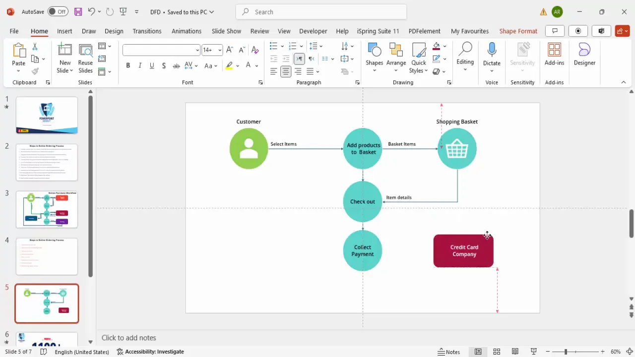
Step 6: Connect Process Steps with Arrows
To show the flow of data between steps, use arrowed lines:
- Go to Insert > Shapes > Line with Arrow.
- Draw arrows connecting the various oval shapes in the order of the process flow.
- Ensure arrows are straight and neatly aligned using guides.
- Label arrows where necessary to clarify the data being passed (e.g., “Item details,” “Shipping request”).
Arrows are critical to visualize the direction of data flow clearly.

Step 7: Add Rectangles for External Entities
External entities like the credit card company or the accounting department are best represented by rectangles:
- Insert rectangles through Insert > Shapes > Rectangle.
- Fill these with distinct colors such as dark purple for the credit card company.
- Remove the outline for a cleaner look.
- Label the rectangles clearly.
These shapes help differentiate internal processes from external stakeholders.
Step 8: Illustrate Two-Way Communication
Some steps involve back-and-forth data exchange, such as payment confirmation with the credit card company:
- Use two arrows pointing in opposite directions between the payment collection step and the credit card company.
- Label one arrow as “Post payment information” and the other as “Payment received confirmation.”
- Flip the arrow direction where necessary using Rotate > Flip Horizontal to ensure clarity.
This clearly communicates the interaction and data exchange between entities.
Step 9: Add Final Process Steps and Departments
Complete your diagram by adding the following:
- Order Issue: Represented by an oval connected after payment confirmation.
- Inventory Department: A rectangle that receives shipping requests.
- Shipping Product: An arrow from inventory to the customer indicating product dispatch.
- Accounting Department: Another rectangle that logs payment and sends receipts.
- Receipt Sent to Customer: An arrow from accounting to the customer showing confirmation.
These elements bring the entire process full circle, showing all interactions and data flows.
Key PowerPoint Functions Used in Data Flow Diagrams
Understanding and mastering certain PowerPoint functions is essential to efficiently create data flow diagrams. Here are some of the most important functions used throughout this process:
| PowerPoint Function | Description | Use Case in Data Flow Diagram |
|---|---|---|
| Insert Icons | Allows insertion of scalable vector icons from PowerPoint’s built-in library. | To represent customers, baskets, or other entities graphically. |
| Insert Shapes | Insert geometric shapes such as ovals, rectangles, and arrows. | Used to create process steps (ovals), external entities (rectangles), and data flow (arrows). |
| Shape Fill & Outline | Customize the fill color and outline of shapes. | To differentiate process steps, departments, and entities with color coding. |
| Text Box | Add labels and descriptions to shapes and arrows. | Label process steps, data flows, and departments clearly. |
| Duplicate (Ctrl + D) | Quickly copy existing shapes or lines for consistency. | For replicating similar shapes or connections to maintain uniformity. |
| Align & Guides | Tools to align shapes and maintain consistent spacing. | Ensures a neat, professional layout with evenly spaced elements. |
| Rotate & Flip | Rotate or flip shapes and arrows. | Used to adjust arrow directions for two-way communication. |
Practical Application of These Functions
For example, when connecting the payment collection to the credit card company, the arrow shapes combined with rotate and flip functions allow you to depict two-way communication effectively. Similarly, duplicating shapes and arrows ensures the diagram maintains a consistent look without manually recreating each element.
Tips for Creating Effective and Professional Data Flow Diagrams
Creating a data flow diagram is not just about placing shapes and arrows on a slide. Here are some best practices and tips to make your diagram both visually appealing and easy to understand:
- Limit Text: Use concise labels to avoid clutter. If more explanation is needed, include it in presenter notes or supplementary slides.
- Use Color Coding: Assign specific colors to different types of entities (e.g., customers, processes, external entities) to help viewers distinguish between them quickly.
- Maintain Consistent Shapes: Use ovals for processes, rectangles for external entities, and arrows for data flow consistently throughout the diagram.
- Align Elements Precisely: Use PowerPoint’s guides and alignment tools to keep your diagram tidy and professional.
- Label Arrows Clearly: Describe the data or action flowing between entities to avoid ambiguity.
- Group Related Elements: Position related steps and departments close together to visually indicate their relationship.
- Use White Space: Avoid overcrowding by spacing out elements, which improves readability.
- Test Your Diagram: Present it to a colleague or friend unfamiliar with the process to ensure it’s understandable.
Applying these tips will enhance the effectiveness of your PowerPoint functions and ensure your audience grasps the process quickly.
Frequently Asked Questions (FAQ)
What is a data flow diagram (DFD)?
A data flow diagram is a graphical representation that shows how data moves through a system, illustrating the inputs, processes, storage points, and outputs. It helps visualize complex processes clearly.
Why should I use PowerPoint for creating data flow diagrams?
PowerPoint offers accessible tools for creating diagrams with customizable shapes, icons, and connectors. It’s widely used in business environments, making it easy to integrate diagrams into presentations.
Can I use other shapes besides ovals and rectangles in DFDs?
While ovals and rectangles are standard for processes and entities, you can use other shapes for clarity or emphasis. However, consistency is key to avoid confusing your audience.
How do I ensure my data flow diagram is professional-looking?
Use PowerPoint’s alignment guides, consistent color schemes, and uniform fonts. Limit text, use meaningful icons, and keep the layout clean and uncluttered.
Is it necessary to label every arrow in the diagram?
It’s best to label arrows that represent significant data flows or actions to prevent ambiguity. However, avoid overcrowding the diagram with too many labels.
Can I animate my data flow diagram in PowerPoint?
Yes, PowerPoint functions include animation options that allow you to introduce elements step-by-step, which can enhance audience understanding during presentations.
Conclusion
Mastering PowerPoint functions to create data flow diagrams is a valuable skill for anyone looking to communicate complex processes effectively. By transforming detailed, text-heavy workflows into clear, visually appealing diagrams, you can engage your audience and convey your message with confidence.
This step-by-step guide has shown you how to build a data flow diagram for an online ordering process using PowerPoint’s icons, shapes, connectors, and formatting tools. Remember to apply color coding, maintain consistent shapes, and use clear labels to maximize clarity.
Whether you’re preparing a presentation for management, training staff, or documenting processes, a well-crafted data flow diagram can make all the difference. So next time you face a complex workflow, consider harnessing the power of PowerPoint functions to bring your ideas to life visually.
Check out the full video: Create Data Flow Diagrams in PowerPoint – Step-by-Step Tutorial


