
Creating engaging, informative, and visually appealing presentations is an essential skill in today’s professional landscape. One of the most effective ways to showcase data progression and timelines is through bar charts. In this comprehensive guide, you will learn how to design a manual bar chart slide in PowerPoint that is not only dynamic but also tailored to your presentation’s needs. This step-by-step tutorial breaks down the entire process, from setting up the slide background to adding animations for a polished finish.
Whether you are a business professional, educator, or student, mastering this PowerPoint slide design technique will help you communicate your data clearly and creatively. Let’s dive in and transform your next presentation with a custom bar chart that visually narrates your story.
Table of Contents
- Overview of the Bar Chart Slide Design
- Setting Up Your Slide Background
- Creating the Bars: Shapes, Colors, and Effects
- Adding Icons, Text, and Shadow Effects
- Grouping, Aligning, and Duplicating Elements
- Creating the Base Table and Shadow Effects
- Inserting Arrows to Show Progression
- Applying Animations for Dynamic Presentation
- Final Tips for PowerPoint Slide Design
- Frequently Asked Questions (FAQ)
Overview of the Bar Chart Slide Design
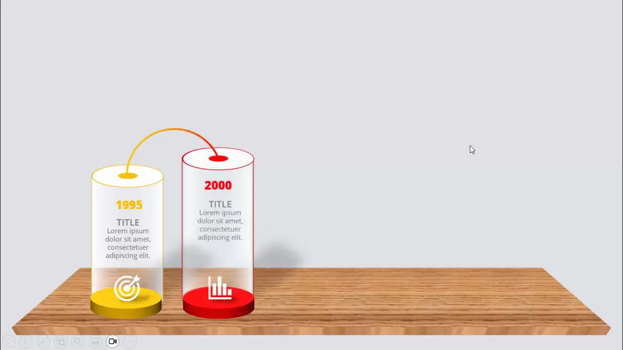
The manual bar chart slide design is a creative approach to displaying a timeline or progression of data points across different years. Unlike automated charts, this design allows for complete customization of colors, shapes, text, and animations, resulting in a visually compelling and unique slide.
In this design, each bar represents a specific year with accompanying information such as a title, detailed text, and an icon. The bars are colored differently to signify changes over time and are layered with shadow effects to add depth and professionalism.
When presenting, each bar appears sequentially upon a click, guiding the audience through the timeline smoothly and engagingly. This design method is perfect for showcasing milestones, project phases, or growth over time.
Setting Up Your Slide Background
The first step in creating your manual bar chart slide is to set the right backdrop that complements the chart without overpowering the content. Here’s how to start:
- Add a new slide: Insert a blank slide in your PowerPoint presentation.
- Change the slide background: Choose a light gray color for the background. A muted tone helps the chart elements stand out clearly.
Choosing a neutral background color like light gray ensures that your colorful bars and icons will be the focal points of the slide. It also provides a professional and clean canvas for your design.
Creating the Bars: Shapes, Colors, and Effects
The bars are the core elements of your chart. This section covers how to create visually appealing bars using PowerPoint shapes, colors, and 3D effects.
Step 1: Creating the Base Shape
- Go to Insert > Shapes and select the Oval shape from the basic shapes.
- Draw an oval on the slide and set its height and width to 1.5 inches for a consistent size.
- Fill the oval with white color using Shape Fill.
- Remove the outline by selecting No Outline under Shape Outline.
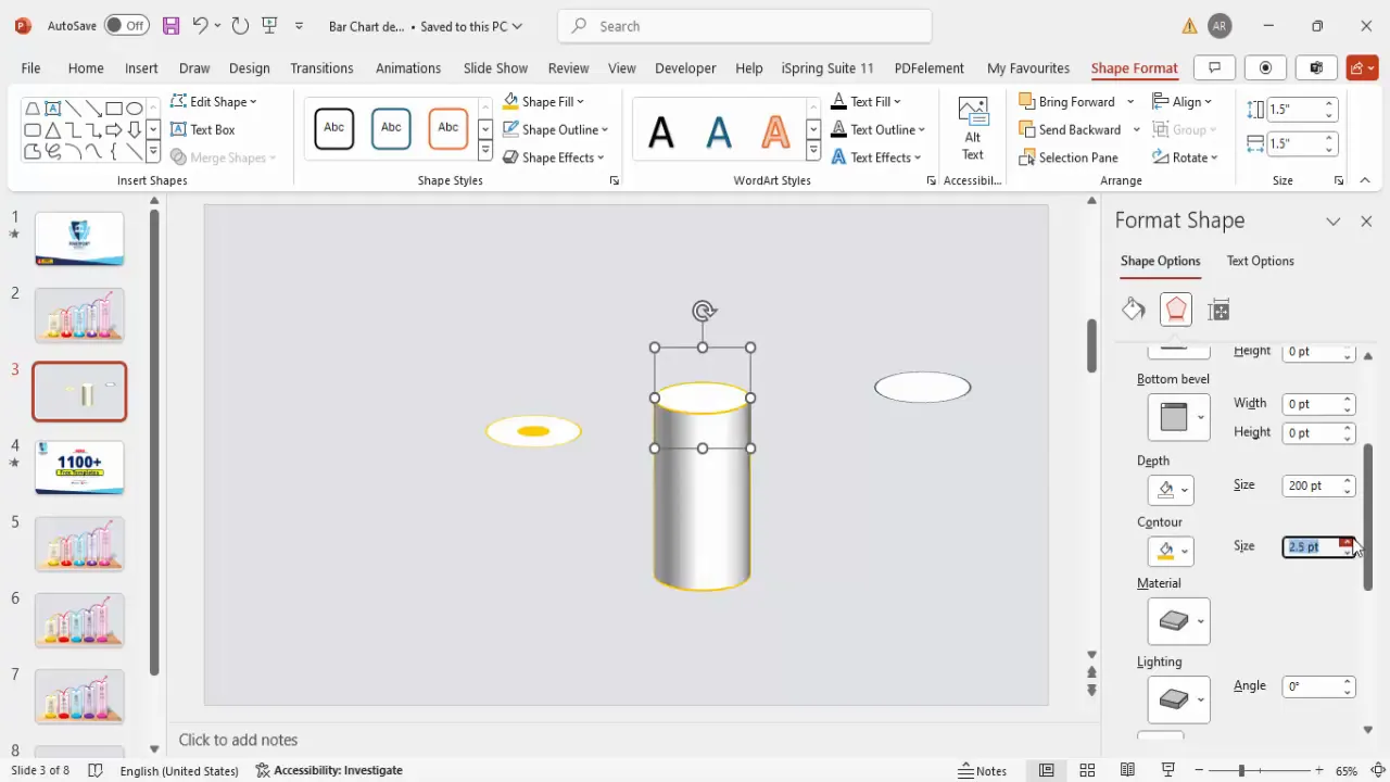
- Right-click the oval, select Format Shape, then navigate to Effects > 3D Rotation.
- Choose the preset Off Axis 1 Top to give the oval a slight 3D tilt.
Step 2: Duplicating the Base Shape
Duplicate the oval shape four times by selecting it and pressing Ctrl + D repeatedly. You will have a total of five ovals. These will be the foundation for your bars.
Step 3: Adding the Inner Circle
- For each oval, create a smaller circle with height and width set to 0.5 inches.
- Fill this smaller circle with an orange color (or your preferred color for the first bar).
- Remove the outline and increase the weight to 2 pt for better visibility.
- Place the smaller circle exactly at the center of the larger oval.
Step 4: Adding Depth with 3D Effects
- Select the oval shape, go to Format Shape > Effects > 3D Format.
- Set the Depth to 200 pt to give the bar thickness.
- Apply an orange contour to enhance the edges.
- Adjust the size of the oval to 2.5 inches in height for a taller bar.
- Under Material and Lighting, set the lighting to Contrasting and material to Clear for a sleek finish.
Step 5: Adding a Smaller Depth Layer
- Create another shape with the same color as the contour but with 20 pt depth to add layering.
- Place this smaller depth shape behind the main bar to create a shadow effect.
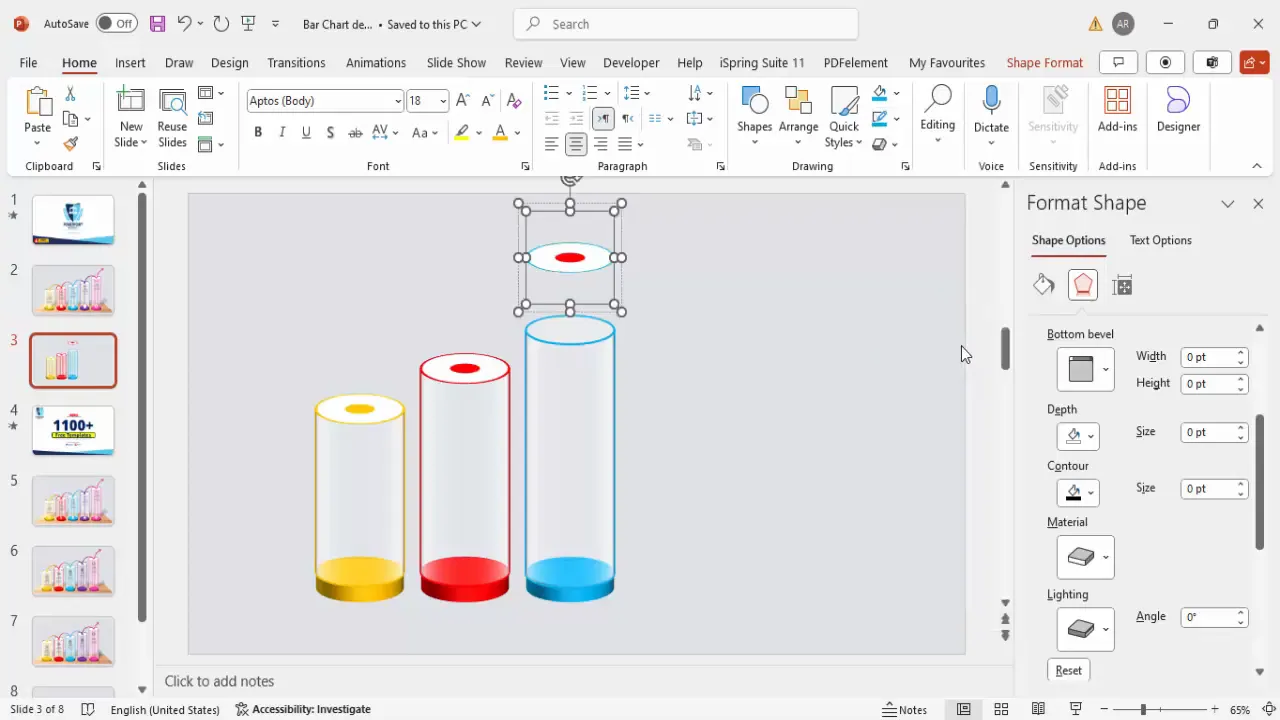
Step 6: Creating Multiple Bars with Different Colors and Heights
Now that the first bar is complete, duplicate it and adjust the depth and colors for the subsequent bars to represent different years or data points.
- Second bar: Increase depth to 250 pt, change color to red.
- Third bar: Increase depth to 300 pt, change color to blue.
- Fourth bar: Increase depth to 350 pt, change color to purple.
Each bar’s color differentiation visually marks the progression in your timeline, making it easier for the audience to track changes.
Adding Icons, Text, and Shadow Effects
To make your bar chart more informative and visually interesting, add icons, text labels, and shadow effects.
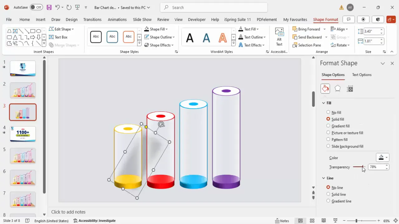
Adding Shadow Effects
- Insert a rounded corner rectangle shape to serve as a shadow base below the bars.
- Fill the shape with black color, increase transparency to around 50-60%.
- Apply soft edges effect for a smooth shadow.
- Rotate and position the shadow beneath each bar for depth.
- Send the shadow shapes to the back layer to keep bars visible.
- Group the shadow with the corresponding bar for easier animation later.
Adding Icons
- Go to Insert > Icons and select icons relevant to your data or timeline.
- Insert icons such as a person, book, or test tube to symbolize different milestones or events.
- Fill the icons with white color for contrast against colored bars.
- Resize icons to about 0.5 inches in height and position them on top of the bars.
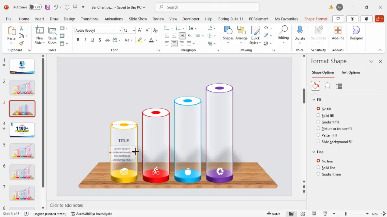
Adding Text: Titles and Descriptions
- Insert text boxes for each bar’s title, aligning the text center.
- Use a bold font style and dark gray color for readability.
- Insert a smaller text box for detailed descriptions or supporting text.
- Keep the text concise to maintain slide clarity.
- Group the title and description with the corresponding bar and icon for easy manipulation.
Grouping, Aligning, and Duplicating Elements
Proper grouping and alignment ensure your slide elements move cohesively and maintain a professional layout.
- Group each bar, its shadow, icon, and text together using Ctrl + G.
- Duplicate grouped elements with Ctrl + Shift + Drag to create additional bars quickly.
- Align all grouped bars horizontally and vertically in the center of the slide.
- Use PowerPoint’s Align tools to distribute the bars evenly and maintain consistent spacing.
This approach saves time and keeps your slide organized, especially when adding animations.
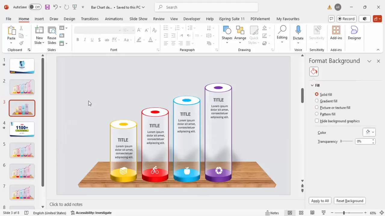
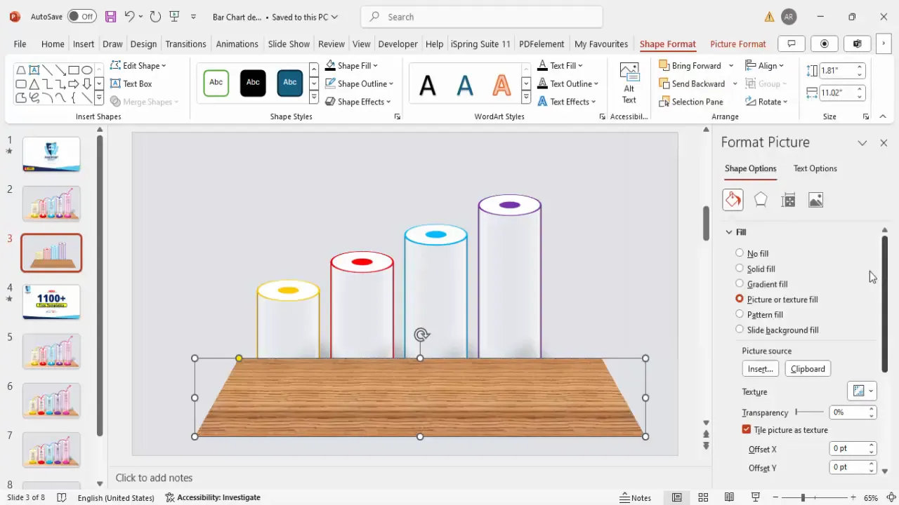
Creating the Base Table and Shadow Effects
To ground your bar chart visually, create a base table that the bars appear to rest upon.
- Insert a trapezoid shape from the basic shapes.
- Resize the trapezoid to a small width and adjust the shape to create a table-like platform.
- Remove the outline and fill the shape with a texture or picture fill for a stylish effect.
- Apply a 3D perspective effect with depth to add dimension to the base table.
- Send the base table behind the bars to create a layered look.
The base table anchors the bars and adds a polished, finished look to your slide.
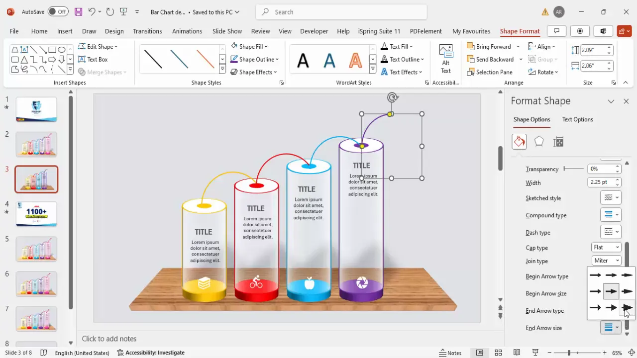
Inserting Arrows to Show Progression
Arrows visually guide your audience through the timeline or progression represented by the bars.

- Insert an Arc shape from the basic shapes.
- Draw the arc while holding the Shift key for proportion.
- Position the arc between bars to indicate movement or progression.
- Set the outline color of the arc to match the color of the corresponding bar (e.g., orange, red, blue, purple).
- Adjust the weight of the outline to around 2 pt for visibility.
- Duplicate and resize arcs as needed to connect all bars in the timeline.
- Add arrowheads at the end of the arcs for clear directionality.
Using color-coordinated arrows strengthens the visual narrative of your data progression.
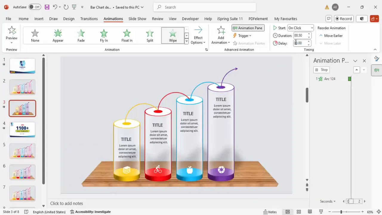
Applying Animations for Dynamic Presentation
Animations breathe life into your slide, making the presentation more engaging and helping you control the flow of information.
Step 1: Enable Animation Pane
- Go to the Animations tab and open the Animation Pane for managing effects.
Step 2: Add Entrance Animations
- Select each grouped bar and shadow set.
- Click Add Animation and choose entrance effects such as Wipe or Stretch.
- Set the Direction of the wipe to match the flow of your timeline (e.g., from left to right).
- Set the animation to trigger On Click or After Previous based on your presentation style.
Step 3: Copy Animations for Consistency
- Copy the animated bars and paste them to duplicate the animation effects across other bars.
- Fine-tune the timing and order in the animation pane for smooth transitions.
Well-executed animations can help the audience focus on each data point sequentially, improving comprehension and retention.
Final Tips for PowerPoint Slide Design
- Keep it simple: Avoid clutter by limiting the number of bars and text on a single slide.
- Use consistent colors: Stick to a color palette that aligns with your brand or presentation theme.
- Align elements precisely: Use PowerPoint’s alignment tools to maintain a clean, professional look.
- Group related elements: This makes moving, duplicating, and animating easier and reduces errors.
- Test animations: Preview your slide in slideshow mode to ensure animations play smoothly and in the correct order.
- Use icons thoughtfully: Choose icons that enhance understanding without distracting from the main content.
- Save templates: Once you create a manual bar chart design, save it as a template for future use to save time.
By following these guidelines, you can create dynamic, professional PowerPoint slide designs that effectively communicate your data story.
Frequently Asked Questions (FAQ)
What is a manual bar chart in PowerPoint?
A manual bar chart is a custom-designed bar chart created using PowerPoint shapes and effects rather than using PowerPoint’s built-in chart tools. This allows for greater creativity and customization.
Why use manual bar charts instead of built-in charts?
Manual bar charts offer flexibility in design, color, and animation that built-in charts may not provide. They allow you to tailor every aspect of the chart to fit your presentation style and branding.
How do I ensure my manual bar chart is aligned properly?
Use PowerPoint’s alignment tools such as Align Center, Align Middle, and Distribute Horizontally to evenly space and align your bars and accompanying elements.
Can I animate manual bar charts?
Yes! You can apply entrance, exit, and emphasis animations to grouped elements like bars, icons, and text to create dynamic presentations.
Are there free templates available for manual bar chart slides?
Many online resources, including PowerPoint University, offer free downloadable templates that you can customize to your needs. These templates save time and provide design inspiration.
What are some tips for choosing colors for my bar chart?
Choose colors that contrast well with your slide background and are consistent with your brand palette. Use different colors to differentiate data points or timelines but keep the palette harmonious.
How do I add 3D effects to shapes in PowerPoint?
Select the shape, go to Format Shape > Effects > 3D Format, and adjust the depth, contour, material, and lighting settings to create the desired 3D appearance.
Can I reuse my manual bar chart design in other presentations?
Absolutely. Group all elements and save the slide or design as a template or duplicate the slide in other presentations to maintain consistency and save time.
How do I make sure animations run smoothly across different devices?
Test your presentation on the devices you will use for presenting. Avoid overly complex animations that may cause lag, and use standard animation effects supported by most PowerPoint versions.
Where can I learn more about advanced PowerPoint slide design?
Channels like PowerPoint University offer extensive tutorials, free templates, and tips ranging from basic to advanced slide design techniques.
With these steps and tips, you are now equipped to create compelling manual bar chart slides that elevate your PowerPoint presentations and captivate your audience.
Check out the full video: Bar Chart Design in PowerPoint


