

Creating visually appealing and functional PowerPoint slides is essential for delivering impactful presentations. One of the most effective ways to represent data and timelines in your slides is through bar charts. However, instead of relying solely on automated chart tools, designing manual bar charts can give you full creative control and allow you to customize every element to fit your presentation style.
In this comprehensive guide, we’ll walk through the step-by-step process of creating an engaging manual bar chart slide design in PowerPoint. This tutorial is designed to help you master the art of crafting dynamic charts that not only display data clearly but also captivate your audience with smooth animations and appealing visuals.
This tutorial is inspired by the expert techniques shared by POWERPOINT UNIVERSITY, a renowned creator of PowerPoint tutorials and free templates. By the end of this article, you’ll have the skills to build a professional bar chart slide from scratch, including layering shapes, adding shadows, incorporating icons, and animating your content for maximum effect.
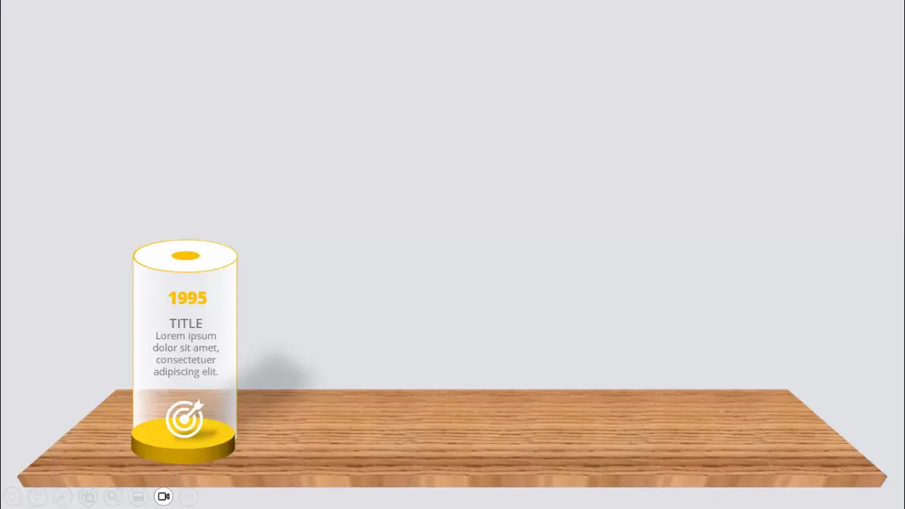
Table of Contents
- Introduction to Manual Bar Charts in PowerPoint
- Setting Up the Slide Background
- Creating the Base Shapes for Bars
- Adding Depth and 3D Effects to Bars
- Customizing Colors and Outlines
- Duplicating and Positioning Bars
- Building the Shadow Effect Platform
- Designing the Table Base for Bars
- Inserting Icons and Text Information
- Adding Arrows to Show Progression
- Applying Animations to Bars
- Conclusion
- Frequently Asked Questions (FAQ)
Introduction to Manual Bar Charts in PowerPoint
A bar chart is a classic visual tool used to compare quantities across categories or over time. While PowerPoint offers built-in chart features, manual bar charts allow for more customization, especially when you want to add unique effects or create interactive slides that reflect a timeline or progress journey.
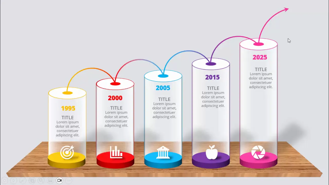
In this tutorial, we will create a timeline bar chart slide showcasing years from 1995 to 2025. Each bar will represent a milestone year with a title, detailed text, and an icon. Additionally, we will add shadow effects and animations to make the slide visually engaging and interactive during presentations.
Setting Up the Slide Background
Before diving into bar creation, the first step is to set the stage with an appropriate slide background. A clean and subtle background helps your chart stand out without distractions.
- Add a new slide: Start by inserting a fresh slide in your PowerPoint presentation.
- Change the slide background color: Choose a light gray color as the background. This neutral tone provides a soft contrast against the colorful bars you’ll create later.
This simple background choice enhances readability and ensures that your manual bar chart remains the focal point of the slide.
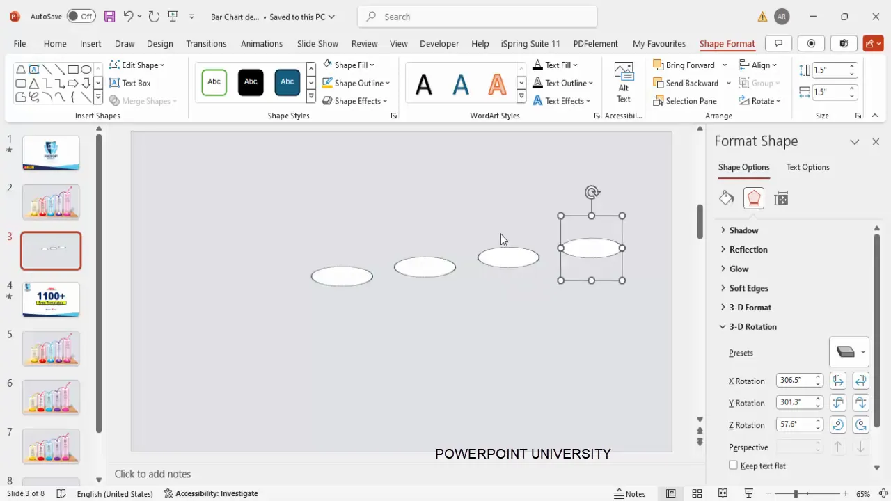
Creating the Base Shapes for Bars
The bars themselves are constructed using PowerPoint’s shape tools. We will begin by creating the fundamental shape for each bar and then customize it with 3D effects and colors.
- Insert an oval shape: Go to Insert > Shapes and select an oval from the basic shapes.
- Set dimensions: Click on the oval and set its height and width to 1.5 inches (or 1.5 units in your size settings).
- Fill color: Change the fill color to white for this base shape.
- Apply 3D rotation: Right-click the shape, select Format Shape, then navigate to Effects > 3D Rotation. Choose the preset Off Axis 1 Top to give the oval a subtle 3D perspective.
- Duplicate the shape: Press Ctrl + D four times to create four duplicates of this shape. These will form the bases for your four bars.
Duplicating shapes saves time and ensures consistency in size and style as you build the chart.
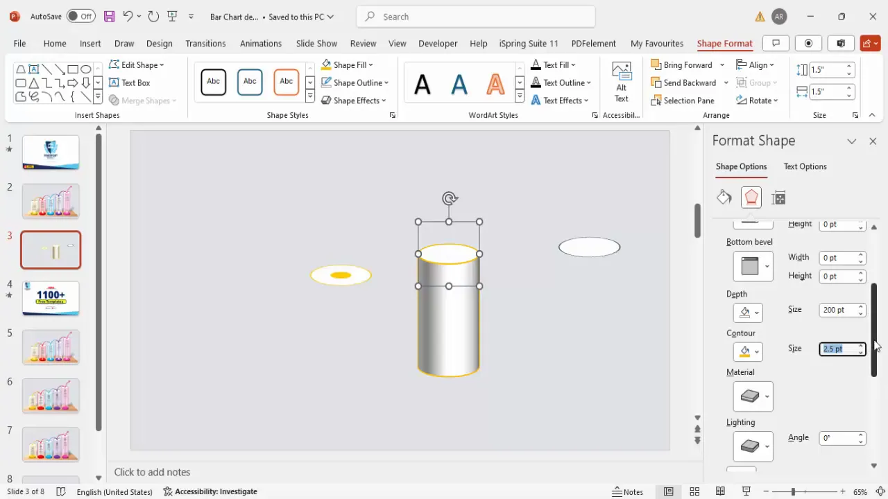
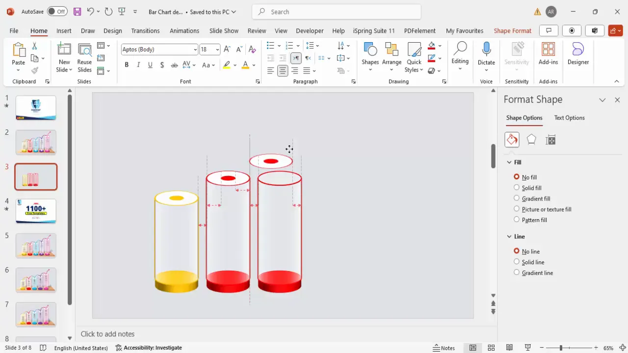
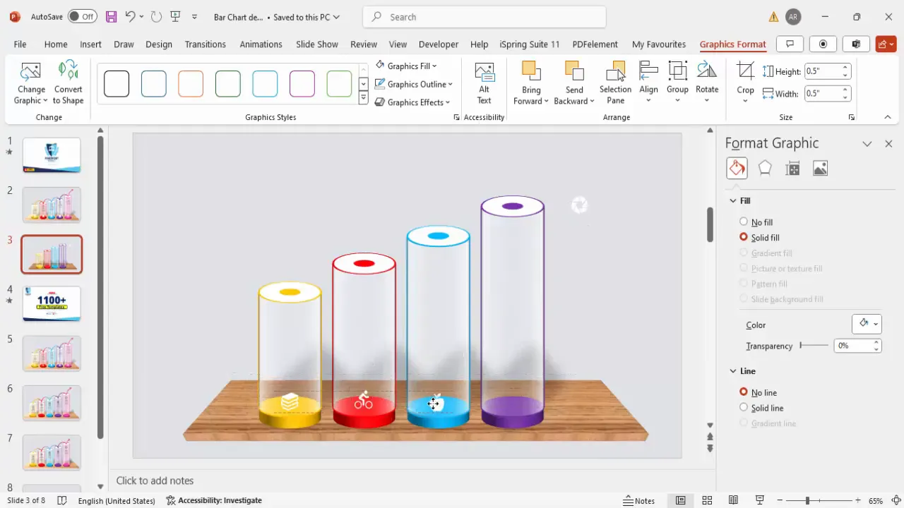
Adding Depth and 3D Effects to Bars
To make the bars visually compelling, adding depth and 3D effects is crucial. This step transforms flat shapes into dimensional bars that seem to rise off the slide.
- Remove outlines: For the first oval, set the shape outline to No Outline.
- Change fill color: Fill the shape with orange to make it vibrant.
- Resize inner oval: Create a smaller oval inside the larger one by setting its height and width to 0.5 inches and center it perfectly.
- Format the bar body: Select the larger oval, remove its outline, and go to Format Shape > 3D Format. Set the depth to 200 points to simulate thickness.
- Add contour color: Apply an orange contour to outline the depth edges, enhancing the 3D effect.
- Adjust size: Increase the height of the oval to 2.5 inches to form the body of the bar.
- Set lighting and material: Choose Contrasting for lighting and Clear for material to give the bar a polished look.
- Group shapes: Group the oval and inner circle together using Ctrl + G to keep them aligned and easy to move.
- Send to back: Position this group so it sits behind other elements, preparing it for layering with other shapes.
This process creates the foundation of a 3D bar that will be duplicated and customized for the timeline.
Customizing Colors and Outlines
Color is key to differentiating each bar in your chart, especially when representing different years or milestones.
- Remove outlines: For the smaller oval shape, set the outline to No Outline.
- Apply 3D depth: Set the depth to a smaller value, such as 20 points, to create subtle layering.
- Send shape to back: Position the smaller shape behind the larger bar to add dimension.
- Change fill colors: For subsequent bars, change the fill and contour colors to red, blue, and purple respectively, matching your timeline’s color scheme.
- Adjust sizes: Increase the depth of each bar incrementally (e.g., 250, 300, 350) to visually represent progression over time.
By varying colors and sizes, your bar chart visually narrates a journey or growth story, making it easier for viewers to understand the data progression.
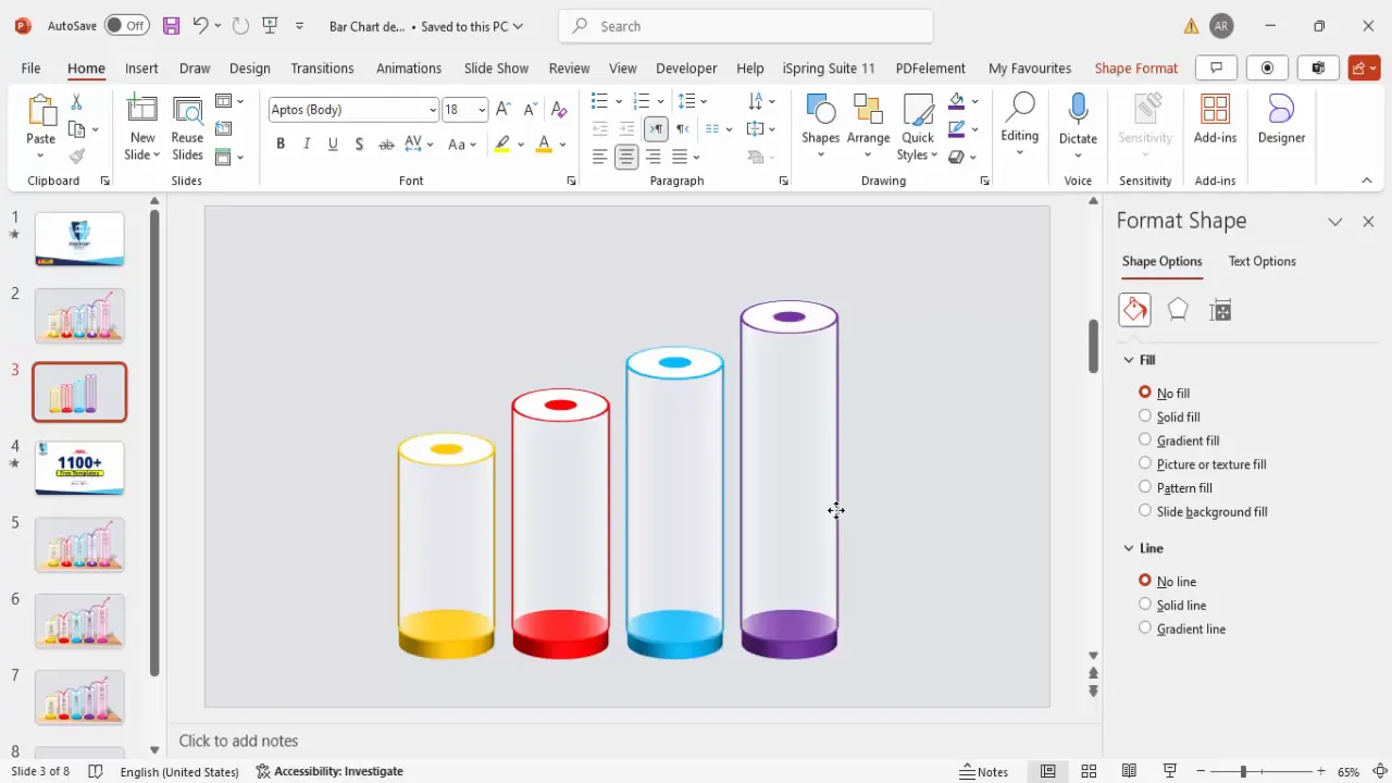
Duplicating and Positioning Bars
With your first bar completed, duplicating and positioning it correctly will build the entire timeline quickly and uniformly.
- Select all elements of the first bar: Grouped shapes make this easier.
- Move aside: Temporarily move the first bar to create space for duplicates.
- Duplicate with keyboard shortcut: Hold Ctrl + Shift and drag the grouped bar upward or to the side to create copies.
- Adjust depth and color: Change the depth and color of each duplicated bar to represent the next timeline milestone.
- Align bars: Ensure all bars are centered and evenly spaced for a clean, balanced look.
- Limit to four bars: For this timeline, four bars are sufficient to convey the message clearly.
Proper alignment and consistent spacing ensure your chart looks professional and is easy to interpret.
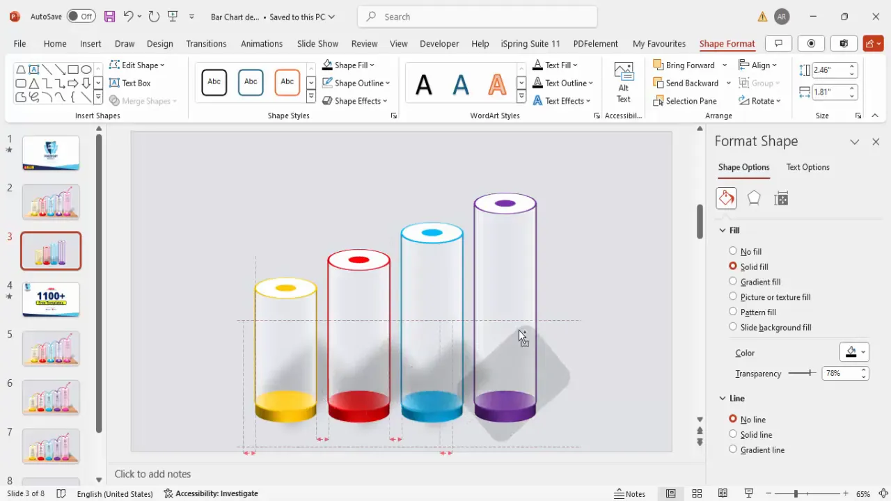
Building the Shadow Effect Platform
Adding shadow effects beneath your bars creates a platform illusion, enhancing the 3D feel and grounding the chart on the slide.
- Insert rounded corner rectangle: Go to Insert > Shapes and select a rounded corner rectangle.
- Resize and position: Adjust the size to fit under your bars, creating a rectangular base.
- Remove outline: Set the shape outline to No Outline.
- Fill with black: Use black fill color and increase transparency to 50-60% for a subtle shadow effect.
- Add soft edges: Go to Format Shape > Effects > Soft Edges and increase the radius to soften the shadow edges.
- Rotate and position: Slightly tilt the shadow and place it beneath the bars. Send it to back to layer correctly.
- Duplicate for each bar: Create matching shadow bases for all bars and group shadows with their respective bars for easier animation and movement.
This shadow platform adds depth and realism to your chart, making it visually appealing and professional.
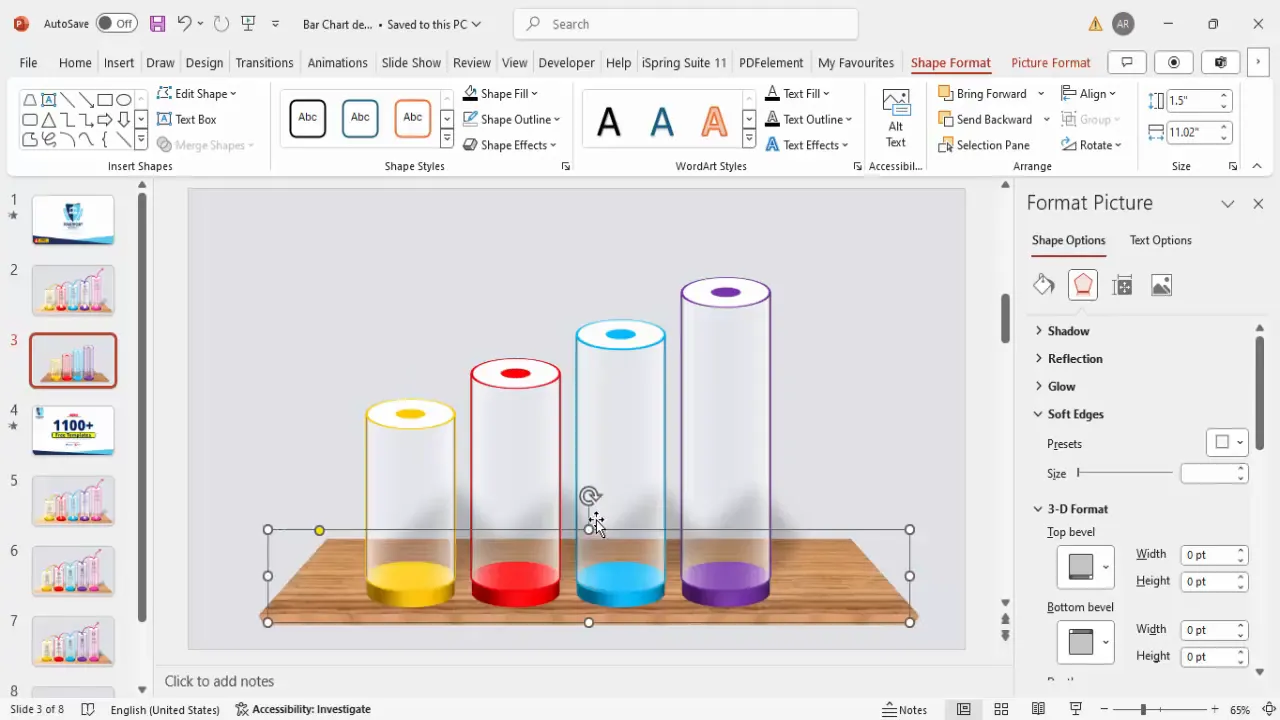
Designing the Table Base for Bars
To further enhance the visual hierarchy, adding a table base for the bars gives the impression that the bars are placed on a solid surface.
Create Slides in Seconds with ExpertSlides AI |
|
Generate AI Presentations today: |
|
TRY NOW! |
- Insert a trapezoid shape: Choose the trapezoid from basic shapes to serve as the table base.
- Resize and adjust width: Make the trapezoid narrow and place it at the bottom of the bars.
- Remove outline: Set the outline to No Outline.
- Apply picture or texture fill: Go to Format Shape > Fill > Picture or texture fill and select a texture that complements your color scheme.
- Add 3D perspective: Use the 3D Format > 3D Rotation preset for perspective and add depth to the trapezoid.
- Adjust darkness: Modify the color tone or transparency to make the base visually distinct but not overpowering.
- Send to back: Place the table base behind the bars and shadow effects.
This table base grounds your bars firmly and adds a polished look to the overall slide design.
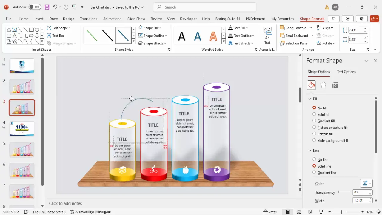
Inserting Icons and Text Information
Icons and text provide context and details for each bar, turning a simple chart into an informative timeline or data presentation.
- Insert icons: Use Insert > Icons to select relevant symbols that represent each timeline event or data point.
- Choose appropriate icons: Pick icons that visually correspond to the content, such as a person, book, or test tube.
- Format icons: Change the icon fill color to white and set the height to 0.5 inches for consistency.
- Position icons: Place each icon on top of its respective bar for clear association.
- Add titles: Insert a text box above or beside each bar, center-align the title, and set it to bold with a dark gray color for readability.
- Add descriptive text: Insert another text box for detailed information. Use concise text (e.g., “Lorem ipsum”) and adjust font size for clarity.
- Group text and icons: Group the icon, title, and description together for each bar to simplify movement and animation.
- Duplicate groups: Use Ctrl + Shift to replicate and position these grouped elements for each bar.
Adding icons and textual information transforms your bar chart into a storytelling tool that communicates more than just numbers.
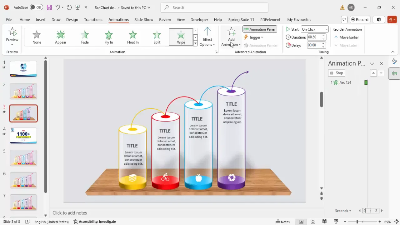
Adding Arrows to Show Progression
To visually represent the flow or progression along the timeline, arrows are a simple yet powerful addition.
- Insert arc shapes: From basic shapes, select the arc to create curved arrows between bars.
- Draw arcs holding Shift: This keeps the arcs symmetrical and neat.
- Resize and position arcs: Place the arcs between bars to show the direction of progression.
- Format arcs: Set the outline color to match the bar color (orange, blue, purple, etc.) and increase the weight to 0.5 pt (two quarters).
- Duplicate arcs: Use Ctrl + D to create multiple arrows.
- Add arrowheads: Go to Format Shape > Line > End Arrow Type and choose a large arrowhead for clarity.
- Optional gradient fill: Apply gradient colors to arcs for a modern, dynamic look.
Arrows guide viewers through the timeline, emphasizing the narrative flow and making the chart easier to follow.
Applying Animations to Bars
Adding animations to your chart elements brings your slide to life and engages your audience during presentations.
- Open the animation pane: Go to Animations > Animation Pane to manage your effects.
- Select a bar or group: Click on the grouped bar or element you want to animate.
- Add entrance animation: Choose from effects such as Stretch or Wipe to animate the bar’s appearance.
- Customize animation direction: For wipes, set the direction (e.g., from left or right) to match the flow of your timeline.
- Set animation timing: Use Start With Previous or After Previous to sequence animations smoothly.
- Copy animations: Use Ctrl + C and Ctrl + V to duplicate animations across other bars for consistency.
- Preview animations: Play your slideshow to ensure animations trigger as expected and adjust timing if necessary.
Animations make your slide interactive and help emphasize each milestone as you progress through your presentation.
Conclusion
Mastering manual bar chart design in PowerPoint elevates your presentation skills by allowing you to create customized, visually appealing charts that tell a story. This tutorial covered everything from setting up the slide background to creating 3D bars with depth, adding shadow effects, integrating icons and text, and animating your slide for dynamic delivery.
By following these steps, you can craft bar charts that not only convey data clearly but also capture your audience’s attention with professional design and smooth animations. Remember, the key to effective PowerPoint slides design is blending creativity with clarity, ensuring your message is both beautiful and easy to understand.
For more creative PowerPoint templates and tutorials, consider exploring resources available at POWERPOINT UNIVERSITY, where you can access over 1,000 free templates and expert guides to enhance your presentation design skills.
Frequently Asked Questions (FAQ)
Q1: Why create manual bar charts instead of using PowerPoint’s built-in chart tool?
Manual bar charts offer greater flexibility in design and customization. They let you add unique 3D effects, shadows, and animations that are harder to achieve with default chart tools. This approach is perfect for storytelling and presentations where visual impact is key.
Q2: How can I align multiple bars perfectly in PowerPoint?
Use the Align tools under the Format tab. Select all bars, then choose Align Center or Distribute Horizontally to ensure even spacing and alignment.
Q3: What are the best colors to use for bar charts?
Choose colors that align with your brand or presentation theme. Use contrasting colors for different bars to differentiate them clearly, and keep the background neutral to make the bars stand out.
Q4: Can I add animations to the icons and text as well?
Yes, grouping the icons and text allows you to animate them together. Apply entrance animations like Wipe or Fade to enhance engagement.
Q5: How do I make sure my manual bar chart is accessible?
Use readable font sizes (minimum 24 pt), high contrast colors, and avoid overly complex animations that may distract. Include descriptive text labels and alt text for any images or icons used.
Check out the full video: Bar Chart Design in PowerPoint


