
Creating PowerPoint slides that captivate and engage your audience is both an art and a science. Many people spend hours designing slides, yet their presentations fall flat because the slides fail to communicate effectively. I’m Leila Gharani, and in this comprehensive guide, I’ll share five powerful tips that can transform your PowerPoint slides from dull and confusing to dynamic and visually compelling.
These tips are designed for anyone who wants to improve their presentation skills—whether you’re a student, a business professional, or a casual presenter. By implementing these strategies, you’ll ensure your audience stays focused on your message instead of getting lost in cluttered slides or dense data. Let’s dive in!
Table of Contents
- 1. Visualize Your Data
- 2. Use White Space and Don’t Clutter
- 3. Apply Instant Design Ideas with PowerPoint’s AI
- 4. Use Scalable Vector Graphics (SVGs) for Crisp Images
- 5. Apply the Rule of Thirds for Balanced Slide Composition
- Bringing It All Together
- Frequently Asked Questions (FAQ)
- Final Thoughts
1. Visualize Your Data
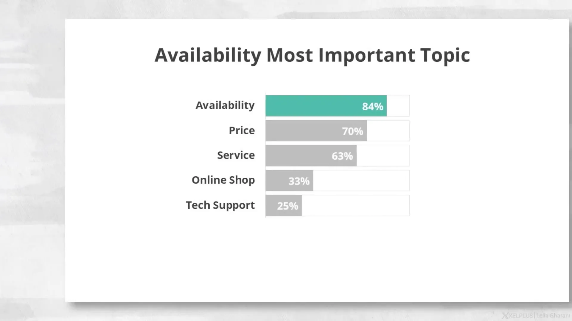
Numbers and data are often the most challenging parts of a presentation. Presenting raw data in tables or dense bullet points is not only boring but also overwhelming for your audience. When you overload your slides with numbers, your audience ends up reading the slide and not listening to what you’re saying.
Instead, the key is to visualize your data in a way that highlights the critical information and makes it easy to interpret. For example, instead of showing a complicated table full of numbers, use charts or graphs that clearly illustrate trends, comparisons, or key takeaways.
Imagine a slide with a title that already communicates the essential insight. Supporting that title with a well-designed chart can guide your audience’s eyes to the important points without distracting details. This approach keeps your presentation engaging and allows you to speak directly to your audience rather than competing with the data on your slide.
Here’s what to keep in mind when visualizing data:
- Simplify: Strip down data to its essential message. Avoid presenting every single figure.
- Highlight: Use colors, arrows, or callouts to focus attention on key data points.
- Use familiar charts: Bar charts, pie charts, and line graphs are easy to understand and widely recognized.
- Tell a story: Your slide should support the narrative you want to convey, not just show data.
By visualizing your data, you make your slides not only easier to understand but also more memorable.
2. Use White Space and Don’t Clutter
One of the biggest mistakes in slide design is cluttering the slide with too much information. Many people feel the urge to fill every inch of the slide, plastering it with text, images, icons, and logos. But this “more is better” mindset is a trap.
White space—sometimes called negative space—is the empty area between and around the content on your slides. It’s not just empty space; it’s a powerful design element that improves readability and focuses attention.
Here’s why white space matters:
- Improves focus: It separates elements, helping the viewer’s eyes land on the most important message.
- Enhances readability: Text with generous spacing is easier to read and less intimidating.
- Creates a calming effect: A slide with breathing room feels less overwhelming and keeps the audience relaxed and attentive.
- Supports brand identity: Clean designs with white space often feel more professional and luxurious, as seen in Apple’s presentations.
White space does not have to be white. It can be any solid color or even a blurred background, as long as it is free of distracting content.
To apply this tip effectively:
- Keep backgrounds clean: Avoid busy patterns or textures that compete with your content.
- Limit logos: You don’t need your company’s logo on every slide. Use it sparingly to avoid visual overload.
- Use large fonts: Make sure your text is big enough to read easily, and use generous line spacing.
- Less text is more: If you can’t fit your message in a large font with space around it, you probably have too much text.
By embracing white space, your slides will be more elegant, impactful, and audience-friendly.
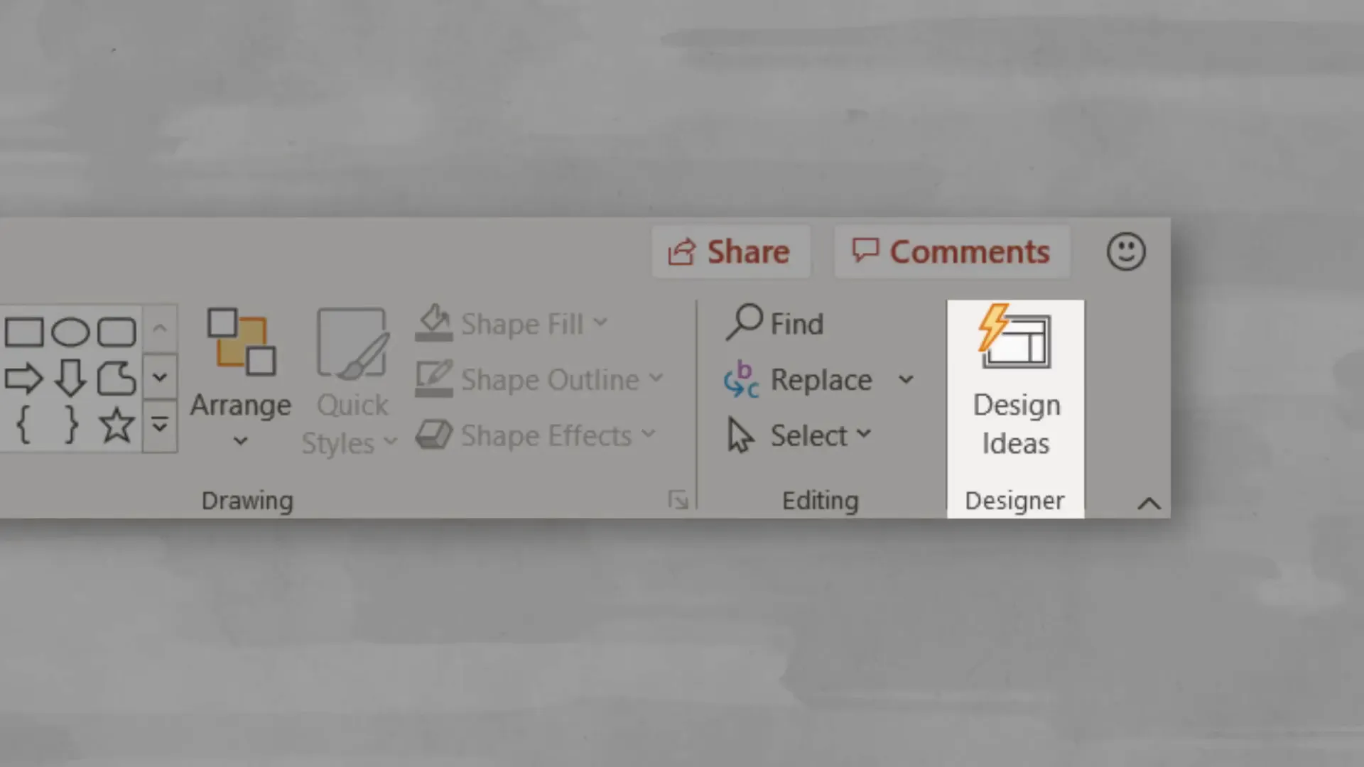
3. Apply Instant Design Ideas with PowerPoint’s AI
If you’re not confident in your design skills or you’re short on time, Microsoft PowerPoint offers a fantastic feature called Design Ideas. Powered by AI, this tool is available on the Home tab and can instantly suggest professional design layouts for your slides.
For example, if you have a plain timeline slide that feels uninspiring, clicking the Design Ideas button will generate several visually appealing alternatives. You can choose one with a single click, instantly upgrading your slide’s look.
Design Ideas also works great with images. It can automatically crop and arrange photos into neat layouts that look polished and intentional, saving you a lot of manual effort.
One thing to note is that Design Ideas tends to avoid bullet points, preferring more visual representations of information. So if your slide is full of bullet points, it will suggest layouts that replace them with icons, graphics, or other visual elements.
You can customize the suggested designs by changing colors or swapping icons, but if the design uses shapes or colors as part of the background, those elements may not be editable.
Design Ideas is a perfect tool for beginners or anyone in a hurry. It’s like having a design assistant giving you a professional head start on your slides.
4. Use Scalable Vector Graphics (SVGs) for Crisp Images
Images are a vital part of any presentation, but many people don’t realize the importance of using the right image formats. When you insert raster images like JPGs or PNGs into your slides, resizing them can cause pixelation and loss of quality.
For instance, if you scale down a raster image, it usually looks fine, but scaling it up will make it blurry and pixelated. This is a common problem when you want to emphasize a logo or graphic but end up with a fuzzy image.
The solution is to use Scalable Vector Graphics (SVGs). SVGs are made of mathematical lines and fills rather than pixels, which means you can resize them infinitely without losing any quality.
SVG files are also smaller in size, helping keep your presentation lightweight and fast.

Recent versions of PowerPoint allow you to insert SVG icons directly from the Insert tab. Even better, you can edit these SVG graphics inside PowerPoint:
- Use the eyedropper tool to change the fill color.
- Convert SVGs to Office shapes to modify individual parts of the graphic.
Whenever possible, choose SVGs over raster images to maintain crisp visuals and professional polish in your presentations.
5. Apply the Rule of Thirds for Balanced Slide Composition
The rule of thirds is a classic photography and cinematography principle that also works wonders in slide design. It helps you compose your slide so that key elements are placed in a way that’s visually balanced and pleasing.
The rule divides your slide into three equal horizontal rows and three equal vertical columns, creating a grid. The four points where these lines intersect are called “PowerPoints” — fitting, isn’t it?

According to the rule of thirds, you should position the most important elements of your slide near these PowerPoints or along the grid lines. This arrangement naturally draws the eye and makes the slide feel harmonious.
For example, if your slide includes an image and some text, position the image so a focal point (like a person’s head) aligns with a PowerPoint. Place your text boxes along the horizontal lines, creating balance and flow.
You can easily apply this rule in PowerPoint by using the built-in guides:
- Go to the View tab.
- Check the box next to “Guides.”
- Add an extra horizontal and vertical guide to create the 3×3 grid.
Try rearranging your slide elements to fit this grid and you’ll likely notice an immediate improvement in visual appeal.
Bringing It All Together
Improving your PowerPoint design doesn’t have to be complicated or time-consuming. By focusing on these five key areas—visualizing your data, using white space effectively, leveraging PowerPoint’s AI-powered Design Ideas, choosing scalable vector graphics, and applying the rule of thirds—you can create slides that are not only beautiful but also clear and engaging.
Remember, the goal of your slides is to support your message, not distract from it. Less clutter, better visuals, and thoughtful composition will keep your audience’s attention where it belongs: on you and your ideas.
Additional Resources for Design Enthusiasts
If you’re interested in diving deeper into design principles—whether for presentations, branding, or general graphic design—I highly recommend exploring learning platforms like Skillshare. It offers thousands of classes on topics ranging from logo design and brand identity to core visual design principles.
One course I personally enjoy is the Graphic Design Basics by Ellen Lupton. It’s concise and packed with examples that clearly explain the five basic design principles. This foundational knowledge can elevate not just your slides, but all your visual communications.
Skillshare’s premium membership is affordable and gives you unlimited access to all classes. If you want to explore new skills or improve existing ones, it’s a great investment in yourself.
Frequently Asked Questions (FAQ)
Q: How much text should I put on a PowerPoint slide?
A: Aim for minimal text. Use large fonts and enough spacing to make it easy to read. If you find yourself shrinking text to fit, you probably have too much content on the slide. Focus on key points and speak to the details instead of writing everything out.
Q: What are the best chart types to visualize data?
A: Bar charts, line graphs, and pie charts are some of the most effective and widely understood chart types. Choose the one that best represents your data story. Avoid overly complicated charts that confuse the audience.
Q: Can I use the Design Ideas feature with any version of PowerPoint?
A: Design Ideas is available in Microsoft 365 versions of PowerPoint. If you’re using an older or standalone version, this feature might not be available.
Q: How do I insert and edit SVG files in PowerPoint?
A: Go to the Insert tab, choose Icons or Pictures, and select an SVG file. Once inserted, you can use the eyedropper tool to change colors or right-click to convert the SVG to shapes for more detailed edits.
Q: Why is the rule of thirds important in slide design?
A: The rule of thirds helps create balanced and visually appealing compositions by placing key elements along grid lines or intersection points. This makes slides easier to look at and helps direct the audience’s attention naturally.
Final Thoughts
Mastering PowerPoint design is a journey, and every small improvement makes a big difference. Whether you’re presenting complex data or telling a compelling story, these five quick tips will elevate your slides and your overall presentation.
Take the time to visualize data clearly, embrace white space, use AI tools like Design Ideas, choose SVG images for crisp visuals, and apply classic composition rules like the rule of thirds. Your audience will thank you for it with their attention and engagement.
Happy presenting!
Check out the full video: 5 QUICK Ways to Improve Your PowerPoint Design


