
PowerPoint slide design is an essential skill for anyone looking to create engaging, professional presentations. Whether you’re a seasoned designer or just starting out, understanding how to transform a simple slide into an interactive and visually captivating experience can elevate your content and captivate your audience. Today, I’m excited to share my approach to a fun and creative slide design challenge where I teamed up with two incredible PowerPoint creators, Luis and Marius. Our task was to redesign the same basic slide about time travel theories, with a maximum of four slides and all original text included.
This article will guide you through my design process, techniques, and the tools I used to craft an immersive, interactive presentation on time travel theories. Along the way, you’ll find practical tips and insights to help you enhance your own PowerPoint slide design projects. Let’s dive in!
Table of Contents
- The Slide Design Challenge: Overview and Rules
- My Design Approach: Structuring the Slide
- Creating Interactivity: Animations, Hyperlinks, and Audio
- Technical Breakdown: Animation Triggers and Morph Transitions
- Resources and Assets: Where I Found Illustrations and Videos
- Final Presentation Walkthrough
- Frequently Asked Questions (FAQ)
- Conclusion: PowerPoint Slide Design as an Art and Science
The Slide Design Challenge: Overview and Rules
In this challenge, three PowerPoint designers—Luis, Marius, and myself—were given the same basic slide featuring three fascinating time travel theories:
- Relativity and Time Dilation
- Wormholes and General Relativity
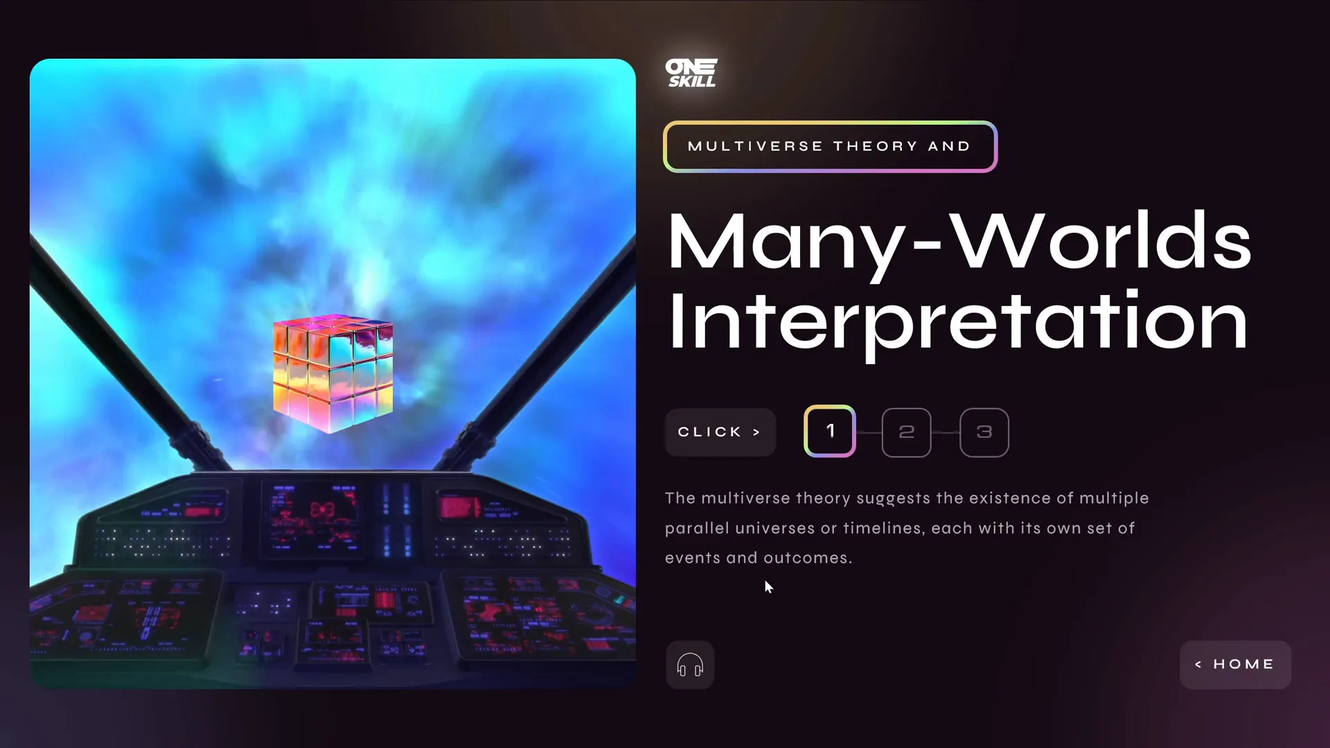
- Multiverse Theory and Many-Worlds Interpretation
Our mission was to redesign the slide in our unique styles while adhering to two strict rules:
- The presentation could include a maximum of four slides.
- All original text from the initial slide had to be included.
This setup was a fantastic opportunity to demonstrate how vastly different and creative PowerPoint slide design can be, even when working with the same content and constraints.
Why These Rules Matter
Limiting the presentation to four slides forces designers to be concise and strategic about content layout and flow. Including all the text ensures that we don’t lose any vital information while still making the slides visually engaging and easy to navigate.

My Design Approach: Structuring the Slide
My goal was to create an interactive, visually appealing experience that breaks down complex scientific theories into digestible pieces. Here’s how I structured my presentation:
Dividing the Screen into Three Equal Parts
Since we had three distinct theories to present, I divided the screen into three equal horizontal sections on the starting slide. Each section represents one theory, making it easy for viewers to focus on individual topics.
- Left Section: Relativity and Time Dilation
- Middle Section: Wormholes and General Relativity
- Right Section: Multiverse Theory and Many Worlds Interpretation
This layout not only organizes the content neatly but also sets up the foundation for interactive navigation through clickable sections.
Visual Style: Holographic and Futuristic Elements
To match the futuristic and scientific nature of time travel theories, I incorporated holographic illustrations that float subtly up and down. This effect adds a dynamic feel to the slide without overwhelming the content.
Additionally, I added a scrolling text banner at the top of the slide to give a sense of continuous motion and energy, fitting for a topic like time travel.
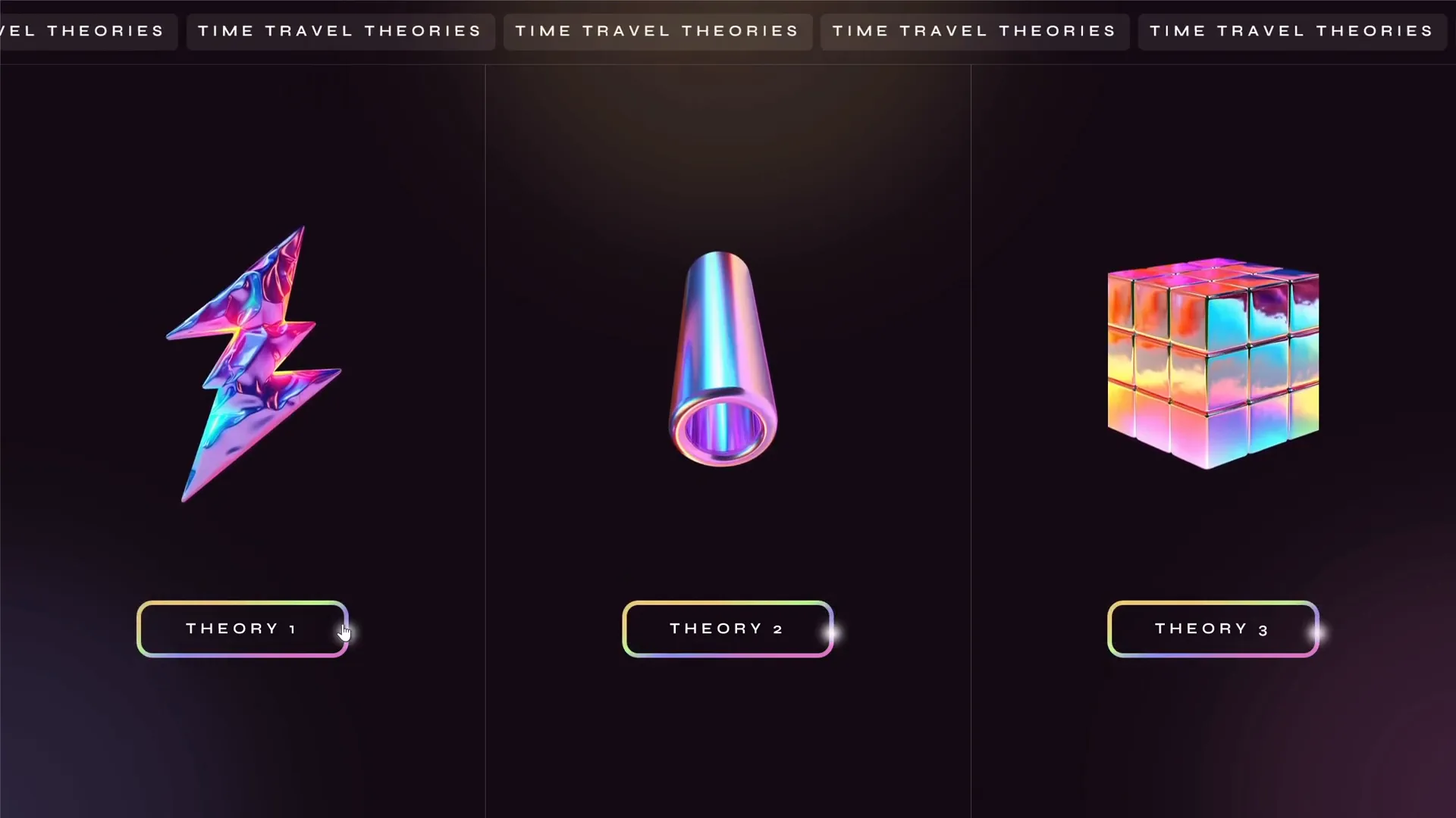
Clickable Sections for Interactive Navigation
Each of the three sections is clickable, allowing users to dive deeper into the respective theory. This interactive menu design helps keep the slide uncluttered, providing a smooth user experience.
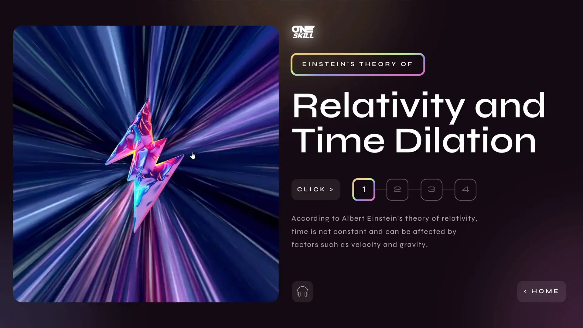
For example, clicking on the “Relativity and Time Dilation” section takes you to a detailed slide dedicated to that topic.
Creating Interactivity: Animations, Hyperlinks, and Audio
One of the most exciting parts of this design challenge was to integrate interactivity and multimedia elements to enhance engagement. Here’s how I did it:
Breaking Down Text into Smaller Pieces with an Interactive Menu
The original slide had a lot of text, which can overwhelm viewers if presented all at once. To solve this, I broke down the text into smaller, manageable passages.
Using an interactive menu with buttons, users can navigate through different parts of the text. When a new button is clicked, the old text smoothly disappears, and the new text fades in. This approach keeps the slide clean and helps maintain focus.
Animations: Highlighting and Text Effects
- Highlight Animation: A small highlight follows a rounded rectangle to emphasize the selected section on the starting slide.
- Swivel Animation: Used to create a flickering effect on text passages, adding visual interest and guiding attention.
These animations are subtle but effective, contributing to the polished feel of the presentation.
Audio Integration with AI Voiceover
To make the presentation more accessible and engaging, I added an audio button that reads the text aloud using an AI-generated voice from the Eleven Labs tool. This feature is especially useful for users who prefer auditory learning or want to follow along hands-free.
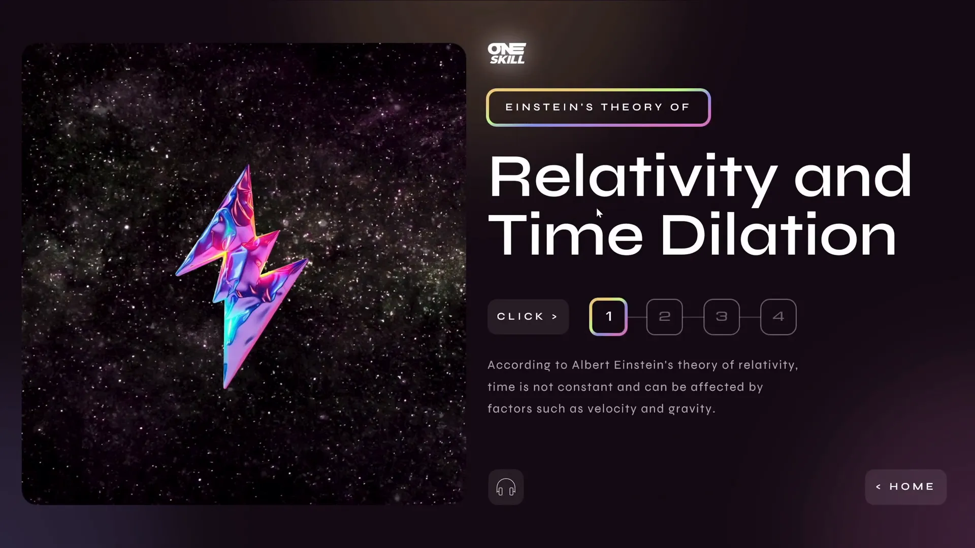
For example, when clicking the audio button on the “Relativity and Time Dilation” slide, the voice narrates:
“According to Albert Einstein’s theory of relativity, time is not constant and can be affected by factors such as velocity and gravity.”
Clickable Holographic Illustrations to Launch Videos
Each detailed slide includes a holographic illustration that, when clicked, launches a looping space-themed video related to the theory being discussed. This multimedia approach adds depth and keeps the audience visually engaged.

Technical Breakdown: Animation Triggers and Morph Transitions
To pull off the seamless interactivity and smooth transitions, I employed several PowerPoint techniques:
Invisible Rectangles with Hyperlinks for Navigation
I created invisible rectangles over the three sections on the starting slide. These act as clickable hotspots linked to the corresponding detail slides. This method allows for clean design without visible buttons cluttering the layout.
Morph Transition for Fluid Animations
Each slide uses the Morph transition effect, which animates the movement of objects between slides. This technique is key to making elements appear as if they are moving naturally from one slide to another, including objects that start outside the slide boundaries and move into view.

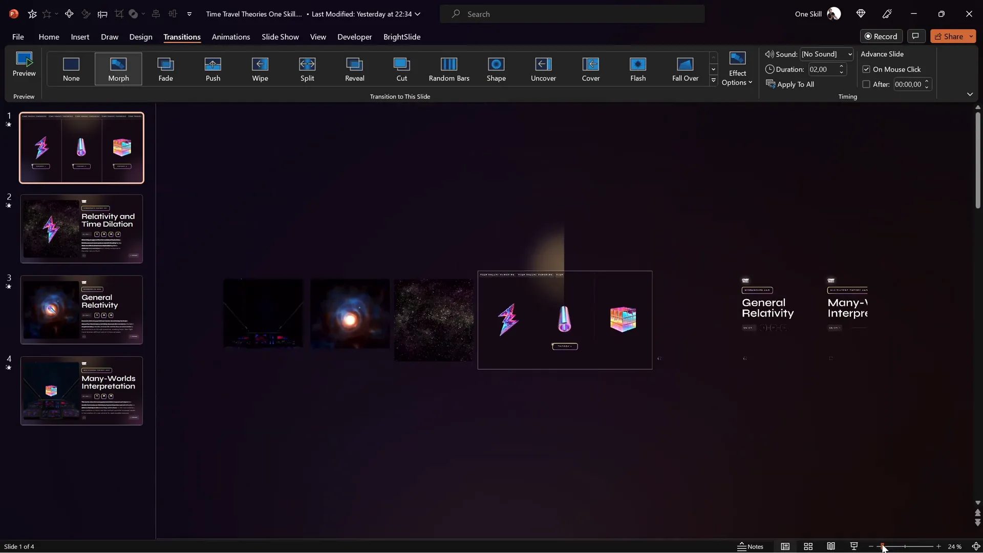
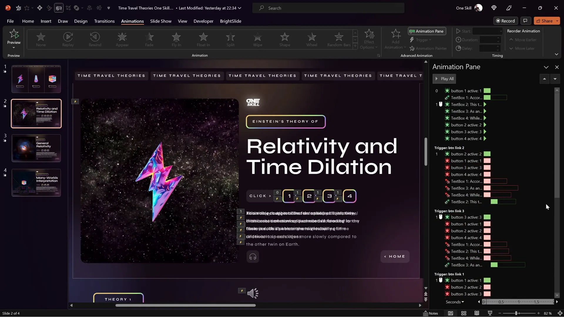
Animation Triggers for Interactive Text Menus
Inside the detailed slides, the interactive text menu is powered by multiple animation triggers. These triggers control the entrance and exit animations of text passages, ensuring that when one piece of text appears, the previous one disappears smoothly.
It’s crucial to synchronize entrance and exit animations with the same triggers so the content swaps cleanly without overlapping.
Kiosk Mode for Controlled Navigation
The presentation is set to kiosk mode, which disables mouse and keyboard clicks for advancing slides. Instead, navigation is controlled solely via hyperlinks and buttons, creating a guided, interactive experience without accidental slide skips.
Resources and Assets: Where I Found Illustrations and Videos
High-quality visuals and multimedia assets greatly enhance the professionalism and appeal of a PowerPoint presentation. For this project, I sourced:
| Resource Type | Source | Description |
|---|---|---|
| Holographic Illustrations | Figma Community | Free holography shapes and PNG packs used for futuristic visual elements. |
| Space Videos | Artlist.io | Looping space-themed videos to complement time travel theories. |
| AI Voiceover | Eleven Labs | Text-to-speech tool used to generate realistic voice narration. |
Final Presentation Walkthrough
Let’s take a guided tour through the final presentation, highlighting key features and user interactions.
Starting Slide: Interactive Overview
The first slide is divided into three clickable sections, each representing a time travel theory. The holographic illustrations gently float, and a highlight follows the mouse or selection to indicate interactivity.

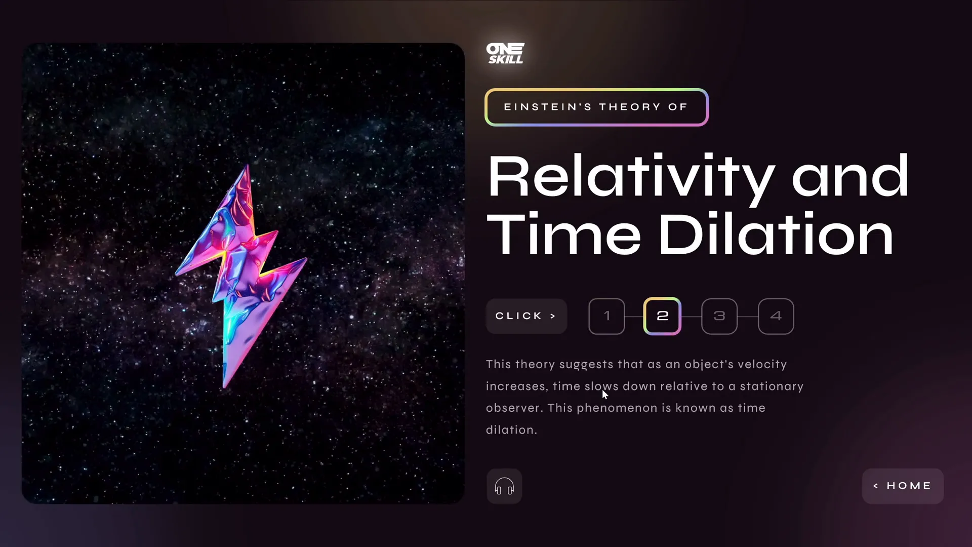
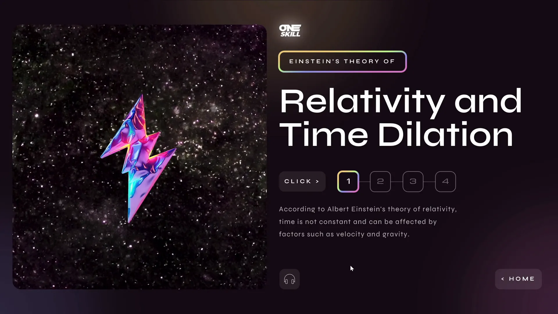
Relativity and Time Dilation Slide
Clicking the first section takes you to a detailed slide explaining Einstein’s theory of relativity and time dilation. The text is broken down into smaller passages accessible via buttons in an interactive menu on the side.
Clicking on the holographic illustration launches a looping video that visually supports the concept.
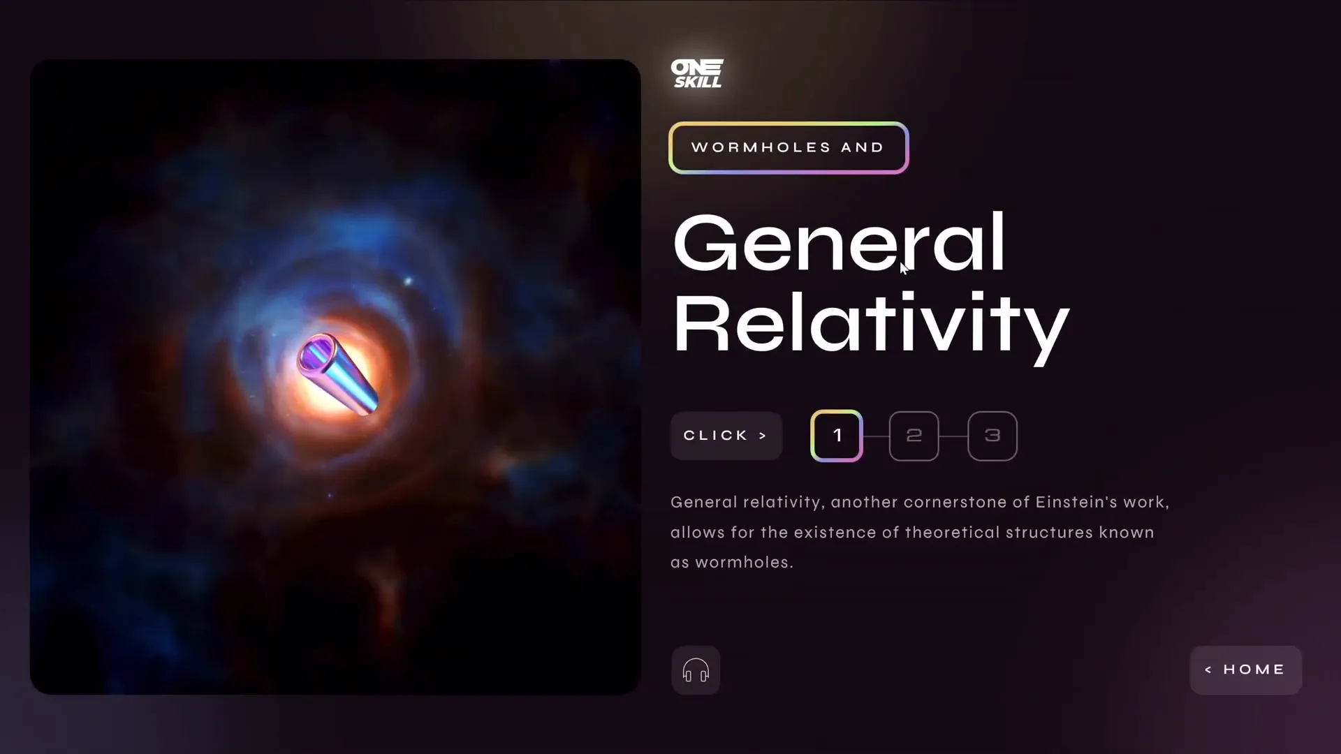
Wormholes and General Relativity Slide
The second section leads to a slide about wormholes and general relativity. Similar interactive elements are used: segmented text, swivel text animations for flickering effects, and a clickable hologram that launches a related video.
Multiverse Theory and Many Worlds Interpretation Slide
The third section explores the multiverse theory, suggesting multiple parallel universes. This slide also features segmented text and a voiceover for the first passage of text, with the option to add more audio if desired.
Navigation and Return to Home
Each detailed slide includes a home button that, when clicked, returns the viewer to the starting slide, enabling easy navigation throughout the presentation.
Frequently Asked Questions (FAQ)
1. How do I create clickable sections in PowerPoint?
You can create clickable areas by inserting shapes (such as rectangles), making them invisible by setting their fill and outline to “No Fill” and “No Outline,” and then adding hyperlinks to navigate to other slides or external content.
2. What is the Morph transition and how does it help?
The Morph transition animates the movement of objects across slides, creating smooth visual effects like sliding, zooming, or fading. It allows elements to move seamlessly from one position to another, enhancing the flow of your presentation.
3. How can I add audio narration in PowerPoint?
PowerPoint lets you insert audio files directly into your slides. You can record your own voice or use AI-generated text-to-speech tools like Eleven Labs to create high-quality narration, then add playback controls to your slides.
4. What are animation triggers and why are they important?
Animation triggers allow animations to start only when a specific action occurs, such as clicking a button. They are essential for creating interactive menus and controlling what appears and disappears in response to viewer actions.
5. How do I make a presentation kiosk mode?
Kiosk mode locks the presentation so viewers can only navigate using hyperlinks or buttons you provide, disabling mouse clicks and keyboard shortcuts that would normally advance slides. This is useful for self-running presentations or exhibitions.
Conclusion: PowerPoint Slide Design as an Art and Science
PowerPoint slide design is more than just placing text and images on a slide — it’s about crafting an experience that communicates your message clearly and engages your audience. This challenge demonstrated how to transform a simple slide into an interactive, multimedia-rich presentation using smart layout, animations, and audio.
By dividing content logically, adding interactive navigation, and incorporating animations and voiceovers, you can elevate your presentations to new heights. Remember, the key to great PowerPoint slide design lies in balancing creativity with clarity and ensuring your audience stays focused on the story you want to tell.
Whether you’re presenting scientific theories like time travel or pitching a business idea, applying these techniques will help you deliver your message with impact and professionalism.
Happy designing!
Check out the full video: 3 PowerPoint Designers Transform The Same Slide 😁✨@lourrutiappt @plsfixppt


